French bristot and Italian bakery

The idea for this project was to combine a French bristot and Italian bakery when renovating an existing retail store. The owner wanted a place where people could enjoy a good coffee while choosing from a fine selection of pastries. Or, to have a sip of wine while eating a slice of an authentic Neapolitan pizza.

The building comprised a big open area with a kitchen at the back. Our proposal was to transform the existing door between the saloon and the kitchen into an arched window. Therefore, the customers could watch part of the production line, which would entice them to taste the freshly baked treats.

French bistrot and Italian bakery

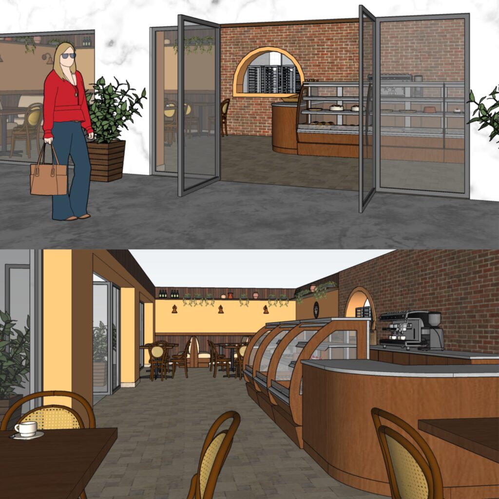
Right in front of the entry door, we placed the main counter, which showcases the house’s specialties. Among the sweet treats, there are croissants, eclairs, muffins, and cakes. The coffee machine and the appliances to prepare juices and smoothies are on the left side, while the point-of-sale is to the right.

In the sitting area, we suggested some tables scattered around and also booths for a more intimate gathering, combining the atmosphere of a French bristot and Italian bakery. Regarding the finishes and materials, we chose timber panels and the classic bistro furniture, evoking reminiscences from Paris. Aiming to bring a bit from Italy, and add a touch of coziness, we added distressed brick and mustard walls. For the floor, natural stone in a light sand colour.

Are you after plans for a French bristot and Italian bakery? Be it a new cafe or restaurant, we can assist you with the design!

Extension project for a university campus

In this extension project for a university campus, the task was to design a 6-storey building to lodge a few different courses. Among them, there were vocational educational and training courses as diverse as lutherie, gas & petroleum, and IT. Or real estate business, institutional communication, and quality management. Each one with its own specificities and requirements in terms of space.

The building was part of a complex of existing buildings and its footage would replace a covered patio and part of the parking lot. Regarding the project briefing, there were chemistry and audiovisual laboratories, including a semi-anechoic chamber. In this chamber, future luthiers would be able to test the musical instruments they design and produce during the course.

The extension project also included a new library for the university campus, as well as an auditorium and meeting rooms. Finally, the building comprised computer laboratories and conventional classrooms of various sizes, besides amenities and storage rooms.


The floors are interconnected by lifts, staircases, and a ramp. The ramp runs within a void, which spans through all 6 levels, visually integrating the internal space. For the facade, contemporary lines and geometric shapes. The chosen finish was ceramic tiles in white and blue, as per the surrounding buildings and the institutional standards.

Wide glass panels strategically positioned help bring light to the interior. The widest panel, located at a northwest facade, has a photovoltaic film that generates electricity. We also suggest other sustainable features, such as green roofs over the hallways that connect this building to the adjacent ones.

For other projects where we had the opportunity to propose sustainable solutions, please click here and here.

Are you also after sustainable solutions for your home or office? Please get in touch!

Concept for a design competition

One more snap of this unbuilt project: a concept for a design competition in a conservation area in Fortaleza, Brazil. In this building for a multipurpose cultural centre, we also used eucalyptus poles as the structure system (click here to see the other concept we prepared for this same design competition).

However, this time we adopted a circular plan, which goes around an internal patio. The rounded shape, plus the thatched roof, reminds an “oca”, the vernacular architecture of the local indigenous peoples. At the centre, the uncovered patio helps to cool off the internal temperature, reducing the need for air conditioning. In order to increase the passive cooling effect, we proposed a raked ceiling with higher windows facing the internal patio. Therefore, the hot air may escape upwards.

The facade has a combination of certified wood and masonry rustically rendered, evoking traditional constructive techniques. Both materials – timber and brick – provide good insulation, which is desirable in a tropical climate. On the floor, we suggested the use of demolition timber planks, promoting the use of recycled materials.

When planning this concept for a design competition, we aimed to design a foyer that could double as an art gallery. Also, we proposed two exhibition rooms for audiovisual presentations, which could host events and workshops. At the back, there is a small library and a cafeteria, so the users can read a book while enjoying a coffee. Administrative areas and amenities are also part of the building, which is accessed either by ramps or a stairway.

Would you like to know more about passive cooling and bioarchitecture? Are you after eco-friendly ideas for your new project?

Let’s have a chat!

House extension on a sloped lot

Back in 2001, we were engaged to design a house extension on a sloped lot. With minimal interference on the existing structure, we were able to create three ensuites and plenty of living areas. This was possible by simply knocking out a few walls in order to create doorways and open up the space.

Additionally, we proposed an extension towards the back of the lot. This addition allowed for a new ensuite and a balcony for the master bedroom. The biggest change, though, was building a staircase to connect the main floor with the undercroft. Previously unused, this level now lodges an entertainment room and space for a home office.

At the back of the lot, we proposed a 3-car garage next to the maid’s room. Both are separated from the house by a backyard. To assist with the everyday hop-in and off, a porte cochere sits beside the house, accessed by a side door.

Regarding the facade, we kept the house style, with a high-pitched roof and a gable end over the front door. To reinforce the classic look, we added white mouldings around the windows, contrasting with a darker colour on the walls.

PS. A maid’s room was something common in Brazil until the late 2000s. Not only in upper-class houses but also in middle-class apartments, which is quite curious. Even though a live-in maid was already rare in those days, many families would still have it as a requirement. Nowadays, the idea of having a maid’s room practically disappeared from the project briefing. On the other hand, other spaces have been gaining popularity, such as mudrooms and home offices.

Are you thinking of renovating your house? Get in touch, and we will be more than happy to assist you with plans.

Transforming a 3-bedroom house

Another one of our favourites: transforming a 3-bedroom house into a 4-bedroom one. From a small house with only one bathroom, the owners would now have a master suite. Through a walk-in robe, they gain access to their ensuite, where a curved wall forms the perfect scenario for the walk-in shower.

Attending to their request, an existing patio made room for the new kitchen, with opens to a balcony facing the mountain views. Aiming to assist with storage and keep the kitchen nice and tidy, we proposed a walk-in pantry. It has two doorways, to both sides of the counter, making it easier to get the necessary ingredients when cooking.

Walk-in pantries and butler’s pantries are a must nowadays, some of them with auxiliary sinks and dishwashers. In this case, we didn’t have too much space, so it only lodges the fridge and small appliances. For other projects where we suggested a walk-in pantry, you may click here and here.


Taking advantage of the sloping lot, we proposed a new garage on the undercroft, reducing the existing one to create two new bedrooms. One of them would be a spare room, doubling as a home office. At the same time, we joined two existing bedrooms to form the master suite.

In the front yard, we proposed a firepit area with access both to the kitchen and to the master suite. The wide sliding doors help bring the outdoors inside the house, creating a perfect home for a growing family.

Did you like our concept for this house renovation? Would you like to have your dream project designed by us? Let’s have a chat!

No job is too small

No job is too small when we love what we do! Be it designing a whole new house or a custom-made screen like in this project. In this example, the clients had recently added a third floor to their house, an extension designed by others. In order to provide independent access to the new floor – which has a self-contained unit – a stairway was built to the side of the house.

Aiming to improve the look of the side facade, the clients wanted to install privacy screens. Therefore, they hired us to explore a few ideas. The goal was to visually reduce the impact of the long stairway, taking advantage of the existing columns to support the screens. Their initial idea was to have two types of screens: vertical slats and a perforated decorative pattern. So the first step was to explore a few different combinations regarding size and shapes.

After they decided on the screen pattern (Reptilia, from Decorative Screens Direct), we did a few colour simulations. Since the screens are in aluminium, we worked based on the available Dulux Powdercoating colour chart. Among the options we suggested, were either Paperback – matching the window frames – or Woodland Grey – contrasting with the white walls.

Which one do you prefer? And which one do you think they went for?


Are you also thinking of installing privacy screens in your house? Are you finding it difficult to choose either the right model or colour? Let’s have a chat!

Modern mid-century bedroom

We’re in love with the warmness of this modern mid-century bedroom, where pieces of contemporary furniture meet others inspired by the 60s. And all tied together by earthy tones!

In this extension project, the owner would like to have a new master bedroom on the 2nd floor, transforming the existing suite into a guest room. He is a big fan of the mid-century style, having a beautifully decorated living room downstairs. So our goal was to keep consistent with the modernist look when designing the extension.

The proposed concept comprised a generous master bedroom with a walk-in robe and an ensuite. For the bedroom, we proposed a hybrid vinyl floor matching the timber of the existing staircase. Behind the bed, an accent wall in grey contrasts with the other walls in a warm tone of white.

Beside the chest of drawers, a comfortable armchair provides the perfect environment for reading a book, one of the owner’s favourite hobbies. In saying that, book shelves are in every corner, to lodge the owner’s huge library. The modernist vibe continues through the chosen artwork, tapestry, and lighting features, making this modern mid-century bedroom comfy & cozy.

Did you also enjoy the warm colours of this bedroom? Are you after some inspiration for your home renovation? We would love to help you! Get in touch today and book your consultation.

Corporate project for a multinational company

A few years ago we were engaged to work on a corporate project for a multinational company: their new educational facilities in Curitiba, Brazil. This company is from Germany, but its South American headquarters are located in Curitiba. The production site spreads around 20,000 sqm of built area, where they manufacture machines for the textile industry. Besides Germany and Brazil, they have units in China, India, Mexico, and the USA, among other countries.

The corporate project for this multinational company involved the renovation of an existing ground-floor building. The educational facilities would have a training room and a videoconference room, as well as toilets and a cafeteria. As per the clients’ request. we used state-of-the-art features. As an example, we specified double glass partitions with blinds operated by remote control for the training room.

Aiming to allow multiple uses of the space, we chose a flexible range of office desks. This furniture allowed for different configurations, such as meeting rooms, classrooms, or team groups. For the coffee bar, we proposed a small kitchenette and tall tables with stools, aiming to create engagement among the attendees. Regarding finishes and materials, we opted for light oak partitions, suggesting neutral greys for both the carpet and floor tiles. For the office chairs, we chose tan leather, the same finish as the stools in the cafeteria.

This was not the only corporate project designed by us. At Instant Design we have plenty of experience in designing commercial spaces, as you may see here or here.

Are you thinking about uplifting your office? Or maybe setting up a new business and in need of some ideas? Let’s have a chat!

Sustainable building for a community centre

In this sustainable building for a community centre, our goal was to explore renewable solutions and use local materials. As part of an architectural competition that comprised two other buildings, we opted for eucalyptus poles as the structural system, with all other buildings sharing the same approach. For the external cladding, we chose certified timber, ensuring the material is from sustainable forests. Regarding the floor, we suggested demolition timber planks.

Aiming for passive cooling, we proposed raked ceilings with cross ventilation and an internal yard. The yard not only assists in cooling off the temperature but also brings natural light to the internal corridors. The same solution was used in another building that was part of the same complex, as you may see here. Regarding accessibility, we proposed two ramps on each side of the building, making it easier for people with disabilities to access the community centre.

Taking advantage of the site’s location, in a coastal area in the Northeast of Brazil, we allocated low-noise compact wind turbines on the roof. They would assist with electricity generation and also create an interesting feature, with its axis anchored in the eucalyptus poles. Furthermore, we proposed solar panels for the hot water system, as the region where the building sits has plenty of sun all year round.

Design competitions are a great way for architects to drive innovation and boost creativity. Are you after innovative and creative solutions for your house? Do you want to know more about passive cooling and sustainable design?

Let’s have a chat! Send us an email or give us a call and we will be happy to assist you!

Dream home for a big family

This project was meant to be the dream home for a big family, with 4 bedrooms and plenty of space for entertainment. However, due to unfortunate events, the owners had to sell the land. Even though the owners didn’t build the house, this is one of our favourite concept designs!

Still up-to-date, it combines contemporary elements, such as open plans and straight lines, with classic ones, such as raked roofs and window trims. For another one of our projects, where we combined a contemporary floorplan with a classic facade, click here.

At the main entry, you have a hallway that leads to the living area, which also gives access to a home office and a powder room. The living area is spacious, comprising a media room, a bar, and a dining area. The dining has views of the pool, with a double-height ceiling above it.

From the dining room, you can access either the second floor or the kitchen. An island benchtop separates the kitchen from the dining room. Being a central piece of the kitchen, the cooktop with an island rangehood allows the owners to cook while enjoying the pool views. Between the kitchen and the 3-car garage, a walk-in pantry makes it easy to store the groceries.

On the second floor, a TV room gathers all the family around their favourite movie. From this central room, we can the four bedrooms, two of which are ensuites. The master one, however, has a walk-in robe, spa bath, and a balcony facing the pool.

PS 1. Out of curiosity, most 2-storey houses in Brazil are made of brick and mortar, hence the thick internal walls. Even though drywall is becoming more and more popular, masonry is still the most prevalent system for the house envelope.

Are you after a dream home for your family as well? At Instant Design we have experience either with residential or commercial projects. Send us a message and let’s have a chat!