Commercial project in a privileged street

In 2013, one of our clients engaged our practice to develop this commercial project in a very privileged street. While the upper level has 6 offices, the ground floor has 2 spacious shops. However, these shops could be either subdivided into 4 units or grouped into a bigger one.

The project occupies the whole lot frontage, taking advantage of the existing zoning parameters. We allocated one shop on each side of the building, with an entryway to the upper level in the middle. The access to the second floor consists of a stairway and a lift, which form an outstanding volume in the facade.

The local legislation permits mezzanines up to 50% of the shop floor, so we suggested a double-height ceiling. Therefore, the shop tenants would be able to maximize their space. We discussed this idea in advance with the structural engineers, who then considered the mezzanine when doing their calculations.

To visually reduce the double height of the first floor, which has wide shop windows, an aluminium awning runs through the main facade. Large steel corten porcelain tiles from Portobello complement the look, along with textured render in neutral colours.

Both the stairway and lift also connect the two floors with the basement, where the parking lot is. Aiming to reduce costs with excavation, we followed the natural profile of the lot. Considering that the ground floor sits 1.6m above the street level, we proposed a curved accessible ramp aiming for accessibility.

On the second floor, a hall gives access to the six offices. While two of them face the front of the lot, the other four are facing back. Having an open-plan room, each office suite has a small kitchenette and an accessible toilet, as per the local regulations.

The owners wanted to provide infrastructure for the air conditioning system in all offices but, at the same time, give the tenants the option to customize the internal floor plan. Therefore, we simulated a few possible layouts, so the engineers could set the best location for the air conditioning equipment.

Soon after the construction, all units were leased. The location on a privileged street was certainly important for this outcome. However, the well-planned spaces, the good-quality materials, and the elegant facade definitely had a positive impact.

At Instant Design, we have plenty of experience planning commercial spaces. And we are ready to assist you with your next job. For other examples of commercial projects we have done in the past, you may click here and here.

Contemporary farmhouse bathroom

Aiming for a contemporary farmhouse look for your bathroom? Choose gloss white subway wall tiles and tapware in brushed gunmetal. If you combine them with cement-look like tiles on the floor, you can’t go wrong. Cement-look tiles, by the way, go well with many other different styles, as you may see in one of our other mood boards here.

For the vanity, we suggest cabinetry in warm timber tones, which may also be present on the floor of the adjacent rooms. For the countertop, Cloudburst Concrete from Caesarstone to match the floor. Regarding sanitaryware, prefer appliances with fewer details, such as the Kado Lux freestanding bath with an oval shape or a rectangular basin with soft corners.

Aiming to boost the vintage look? Mix and match objects in black or antique silver, such as wall lights, robe hooks, and mirrors. Bric-a-brac markets and op-shops are great places to find antique objects full of character and charm. Finally, don’t forget to add plant pots, bringing nature to inside your bathroom!

Bath: Kado Lux Petite 1500mm White (Reece)
Basin: Max Gloss White Ceramic (ADP)
Floor tile: Windsor Matte Grey Concrete Look 600×600 (Tile Cloud)
Tapware: Mizu Drift (Reece)
Wall light: Arti (Nook Collections)
Robe hook: Nostalgic Farmhouse Antique Pewter (Restoration Online)

Thinking about renovating your bathroom? Did you like our contemporary farmhouse bathroom? Get in touch for more details!

Building renovation: facade uplift

Back in 2012, we had the opportunity to assist one of our corporate clients with this renovation project. The building renovation included not only a facade uplift but also a new internal layout. At the upper level, we proposed curved panels in aluminium to hide the existing individual balconies, bringing movement and unity to the building.

Curves were also present in other elements of this renovation, such as the textured concrete wall which hides a generator, to the right side of the stairway. Or the accessible ramp, which performs a smooth curve that leads to the entry door. Indeed, curved ramps are a clever idea when we need to reach a different level within a small space. We used a similar approach in some of our architectural projects, as you may see here and here.

We developed this building renovation project for a company that manipulates enteral nutrition and chemotherapy medication. Our role comprised not only designing a facade uplift and the internal layout for the administrative areas but also coordinating other professionals. Among the external consultants, there was the team in charge of the laboratory equipment and the air conditioning system, for example.

The first floor, located below street level, lodges storage and the logistics department. On the other hand, the second one has the laboratories and the main entry. The original project had two wide stairways leading to the entry, which posed an obstacle for people with disabilities. So we reduced the width of the stairs, proposing an accessible curved ramp instead.

The third floor lodges the administrative staff, a meeting room and the director’s office. On that floor, we took advantage of the existing walls to minimize costs. To complete the project, we designed the landscaping and a totem with the company logo, which was installed in the front garden.

Are you after a building renovation or a facade uplift for your home or office? Maybe colour consulting services? We can assist you!

Dark tones and golden accessories

The first of our mood boards matches dark tones and golden accessories, celebrating winter in a luxurious way. To create a moody bathroom, we suggest a matte black ceramic basin paired with a black wall-hung vanity. The fluted door panel with a bevelled frame adds sophistication to the piece of furniture, altogether with the countertop and handles in Corian.

Aiming to bring some coziness, mosaic tiles in emerald green. The same colour is present in the wallpaper, portraying tropical plants against a charcoal background. For the floor, neutral dark grey tiles. Regarding the tapware, we suggest wall basin mixers with curved spouts in brushed gold and hooks instead of tower rings. To complement the look, a wall sconce with frosted glass and a mirror, both with golden accents. The mirror may be either round with a simple frame, or square with a vintage frame.

Are you after more ideas for a glamorous bathroom? Click here and here for other mood boards showcasing dark tones or golden accessories.
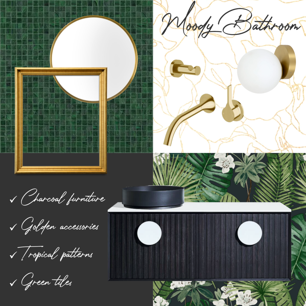
Vanity: Issy Halo (Reece)
Basin: Roca Inspira Light (Reece)
Mosaic tiles: GM10.55 (Bisazza)
Wallpaper: Isla Leaf Black Muriva (World of Wallpaper)
Tap and robe hook: Milli (Reece)
Wall light: Mino 1 (Beacon Lighting)

Are you interested in adding some glamour to your bathroom as well? Give us a call and we will be glad to assist you!