Tag facadedesign

No job is too small

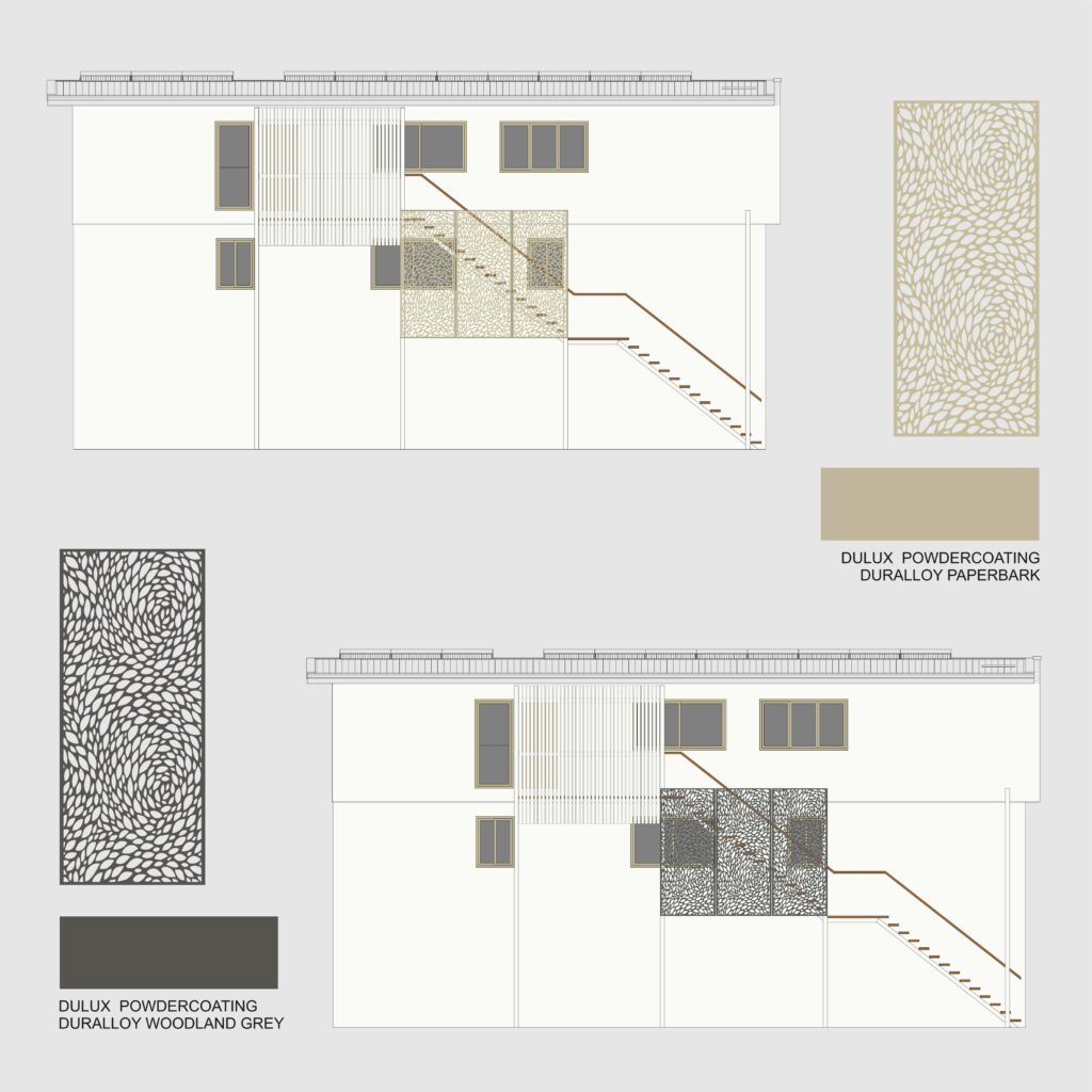
No job is too small when we love what we do! Be it designing a whole new house or a custom-made screen like in this project. In this example, the clients had recently added a third floor to their house, an extension designed by others. In order to provide independent access to the new floor – which has a self-contained unit – a stairway was built to the side of the house.

Aiming to improve the look of the side facade, the clients wanted to install privacy screens. Therefore, they hired us to explore a few ideas. The goal was to visually reduce the impact of the long stairway, taking advantage of the existing columns to support the screens. Their initial idea was to have two types of screens: vertical slats and a perforated decorative pattern. So the first step was to explore a few different combinations regarding size and shapes.

After they decided on the screen pattern (Reptilia, from Decorative Screens Direct), we did a few colour simulations. Since the screens are in aluminium, we worked based on the available Dulux Powdercoating colour chart. Among the options we suggested, were either Paperback – matching the window frames – or Woodland Grey – contrasting with the white walls.

Which one do you prefer? And which one do you think they went for?

Are you also thinking of installing privacy screens in your house? Are you finding it difficult to choose either the right model or colour? Let’s have a chat!
Building renovation: facade uplift

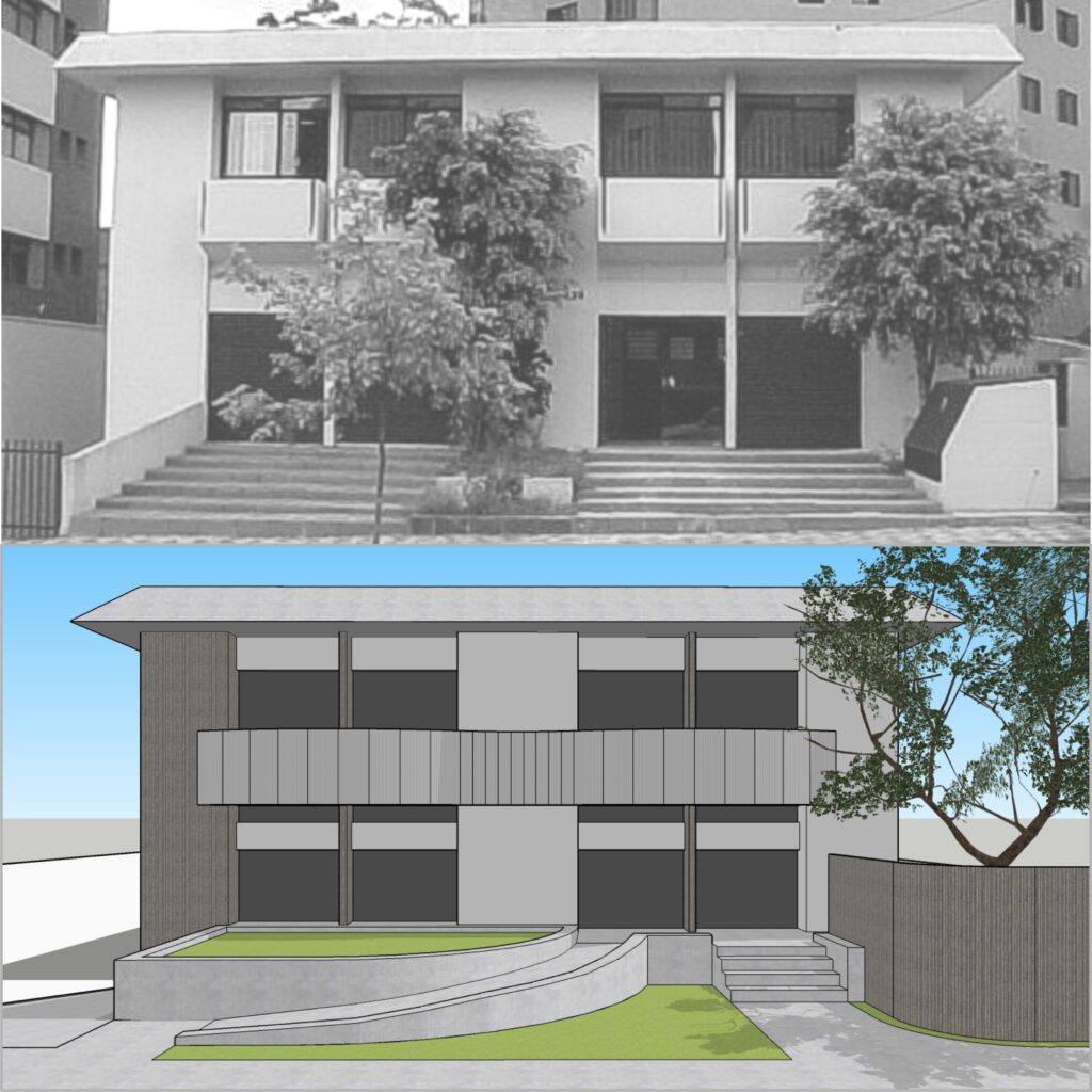
Back in 2012, we had the opportunity to assist one of our corporate clients with this renovation project. The building renovation included not only a facade uplift but also a new internal layout. At the upper level, we proposed curved panels in aluminium to hide the existing individual balconies, bringing movement and unity to the building.

Curves were also present in other elements of this renovation, such as the textured concrete wall which hides a generator, to the right side of the stairway. Or the accessible ramp, which performs a smooth curve that leads to the entry door. Indeed, curved ramps are a clever idea when we need to reach a different level within a small space. We used a similar approach in some of our architectural projects, as you may see here and here.

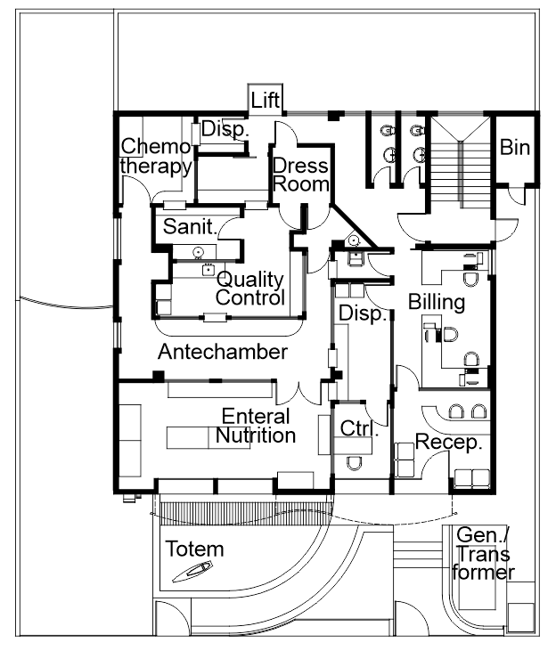
We developed this building renovation project for a company that manipulates enteral nutrition and chemotherapy medication. Our role comprised not only designing a facade uplift and the internal layout for the administrative areas but also coordinating other professionals. Among the external consultants, there was the team in charge of the laboratory equipment and the air conditioning system, for example.

The first floor, located below street level, lodges storage and the logistics department. On the other hand, the second one has the laboratories and the main entry. The original project had two wide stairways leading to the entry, which posed an obstacle for people with disabilities. So we reduced the width of the stairs, proposing an accessible curved ramp instead.

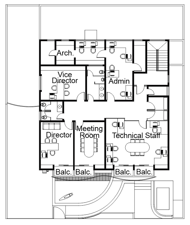
The third floor lodges the administrative staff, a meeting room and the director’s office. On that floor, we took advantage of the existing walls to minimize costs. To complete the project, we designed the landscaping and a totem with the company logo, which was installed in the front garden.

Are you after a building renovation or a facade uplift for your home or office? Maybe colour consulting services? We can assist you!