Modern mid-century bedroom

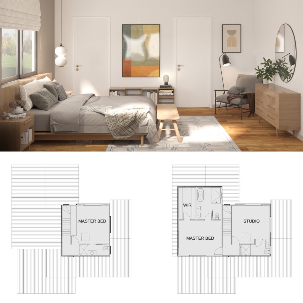
We’re in love with the warmness of this modern mid-century bedroom, where pieces of contemporary furniture meet others inspired by the 60s. And all tied together by earthy tones! In this renovation project, the owner asked for a new master bedroom on the 2nd floor. Then, he wanted to transform the existing one into a studio and guest room. Above all, though, he was a big fan of the modern mid-century look and would like this style for his master bedroom.

The proposed extension comprised a generous master bedroom with a walk-in robe and an ensuite. For the bedroom, we proposed a hybrid vinyl floor matching the timber of the existing staircase. Behind the bed, an accent wall in grey contrasts with the other walls in white.

Beside the chest of drawers, a comfortable armchair provides the perfect environment for reading a book, one of the owner’s favourite hobbies. Book shelves are in every corner, to lodge the owner’s huge collection. The modernist vibe continues through the artwork, the tapestry, and the lighting features, making this bedroom comfy & cozy.

Did you also enjoy the warm colours of this bedroom? Are you after some inspiration for your home renovation? We would love to help you! Get in touch today and book your consultation.

Assisted bathrooms: more and more popular

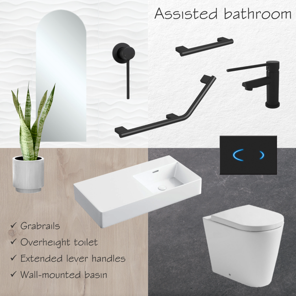
Assisted living bathrooms are becoming more and more popular. Especially with an increase in the elderly population, allowing people to stay longer in their own homes. These bathrooms provide a few different features, both for safety and accessibility, such as grabrails and overheight toilets.

These overheight toilets can be installed with sensor flush buttons, for example, which are touchless and therefore more hygienic. Electronic bidets are also useful when talking about hygiene. Some brands of bidets can be coupled with existing toilets, depending on the size and shape of the pan. They offer an additional level of comfort for the user, with heated seats and different jets of water.

For wheelchair users, mixers with extended levers are essential, as well as wall-mounted basins and walk-in showers. For low-vision users, matte black tapware offers good contrast with white tiles, making it easy to locate the handles. On the floor, a slip-resistant tile is a great option to prevent accidents. This feature is useful not only for the elderly but for anyone who wants a safer bathroom.

Overheight toilet: Kado Lux (Reece)
Flush button: Hideaway Sensor (Reece)
Wall-mounted basin: Petra 800 (Fienza)
Tapware: Hustle Care (Fienza)
Grabrails: Mizu Assisted Living (Reece)
Mirror: Arch Mirror 450×1175 (Fienza)
Floor tiles: Concrete Fusion Anthracite (National Tiles)
Wall tiles: 3D Wave Gloss (National Tiles)

Are you thinking of adapting your bathroom as well? It’s not all about a nice look: you also need to take into account the standards and regulations.

Instant Design has the skills to assist you in this matter. Get in touch today to book a consultation!

Corporate project for a multinational company

A few years ago we were engaged to work on a corporate project for a multinational company: their new educational facilities in Curitiba, Brazil. This company is from Germany, but its South American headquarters are located in Curitiba. The production site spreads around 20,000 sqm of built area, where they manufacture machines for the textile industry. Besides Germany and Brazil, they have units in China, India, Mexico, and the USA, among other countries.

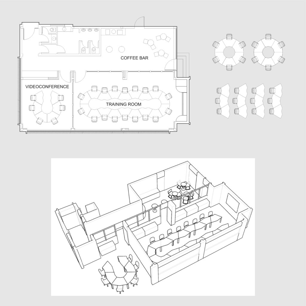
The corporate project for this multinational company involved the renovation of an existing ground-floor building. The educational facilities would have a training room and a videoconference room, as well as toilets and a cafeteria. As per the clients’ request. we used state-of-the-art features. As an example, we specified double glass partitions with blinds operated by remote control for the training room.

Aiming to allow multiple uses of the space, we chose a flexible range of office desks. This furniture allowed for different configurations, such as meeting rooms, classrooms, or team groups. For the coffee bar, we proposed a small kitchenette and tall tables with stools, aiming to create engagement among the attendees. Regarding finishes and materials, we opted for light oak partitions, suggesting neutral greys for both the carpet and floor tiles. For the office chairs, we chose tan leather, the same finish as the stools in the cafeteria.

This was not the only corporate project designed by us. At Instant Design we have plenty of experience in designing commercial spaces, as you may see here or here.

Are you thinking about uplifting your office? Or maybe setting up a new business and in need of some ideas? Let’s have a chat!

Sustainable building for a community centre

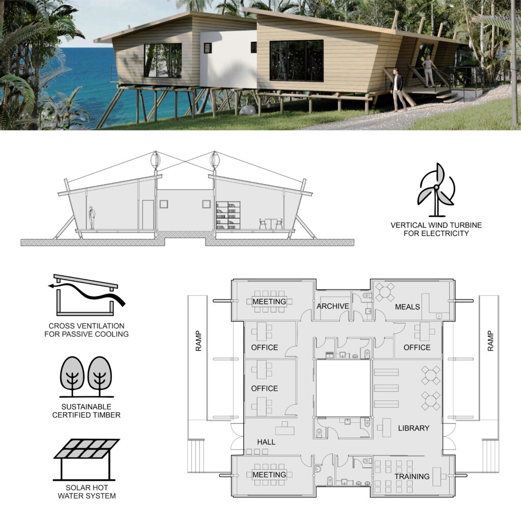
In this sustainable building for a community centre, our goal was to explore renewable solutions and use local materials. As part of an architectural competition that comprised two other buildings, we opted for eucalyptus poles as the structural system, with all other buildings sharing the same approach. For the external cladding, we chose certified timber, ensuring the material is from sustainable forests. Regarding the floor, we suggested demolition timber planks.

Aiming for passive cooling, we proposed raked ceilings with cross ventilation and an internal yard. The yard not only assists in cooling off the temperature but also brings natural light to the internal corridors. The same solution was used in another building that was part of the same complex, as you may see here. Regarding accessibility, we proposed two ramps on each side of the building, making it easier for people with disabilities to access the community centre.

Taking advantage of the site’s location, in a coastal area in the Northeast of Brazil, we allocated low-noise compact wind turbines on the roof. They would assist with electricity generation and also create an interesting feature, with its axis anchored in the eucalyptus poles. Furthermore, we proposed solar panels for the hot water system, as the region where the building sits has plenty of sun all year round.

Design competitions are a great way for architects to drive innovation and boost creativity. Are you after innovative and creative solutions for your house? Do you want to know more about passive cooling and sustainable design?

Let’s have a chat! Send us an email or give us a call and we will be happy to assist you!

Dream home for a big family

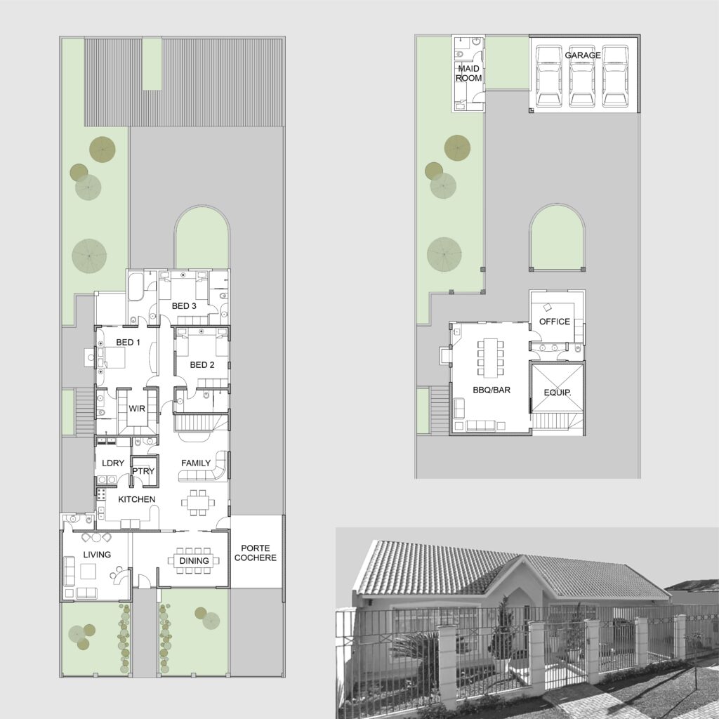
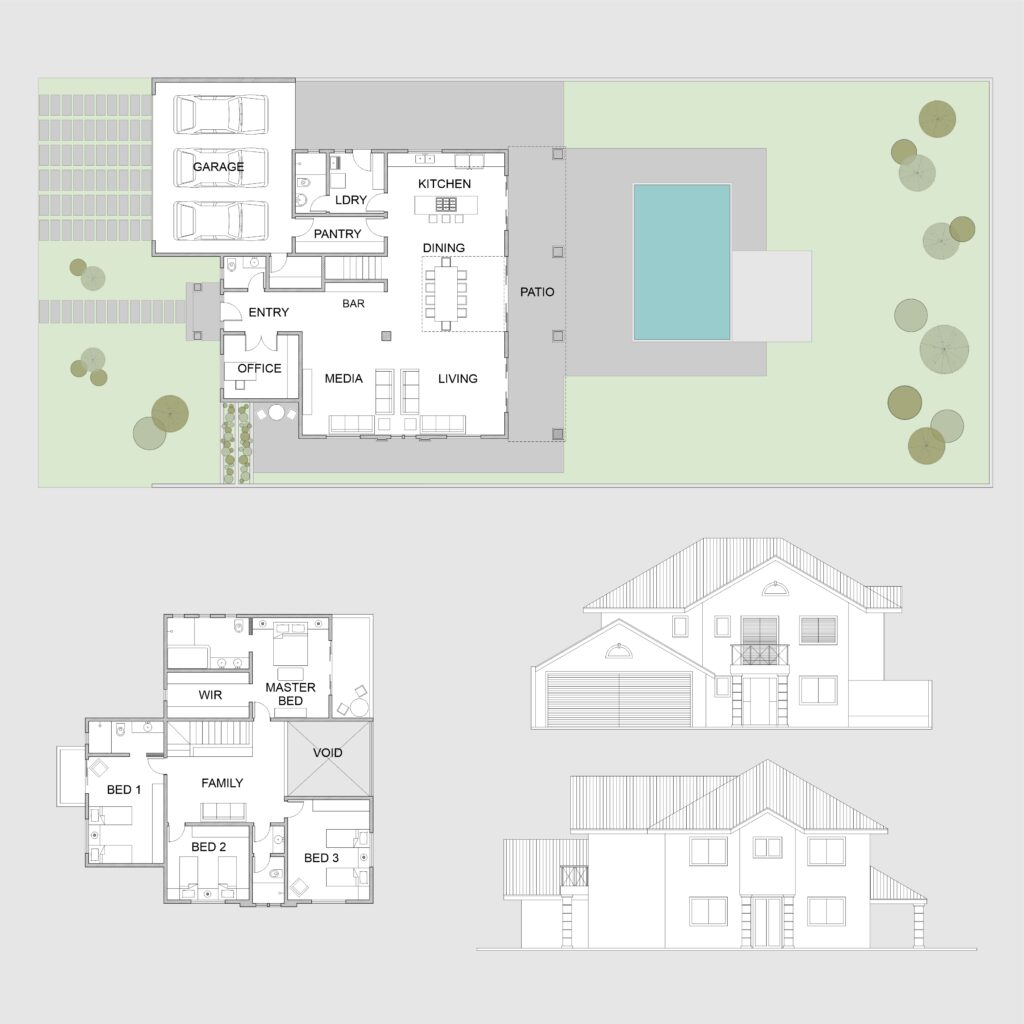
This project was meant to be the dream home for a big family, with 4 bedrooms and plenty of space for entertainment. However, due to unfortunate events, the owners had to sell the land. Even though the owners didn’t build the house, this is one of our favourite concept designs!

Still up-to-date, it combines contemporary elements, such as open plans and straight lines, with classic ones, such as raked roofs and window trims. For another one of our projects, where we combined a contemporary floorplan with a classic facade, click here.

At the main entry, you have a hallway that leads to the living area, which also gives access to a home office and a powder room. The living area is spacious, comprising a media room, a bar, and a dining area. The dining has views of the pool, with a double-height ceiling above it.

From the dining room, you can access either the second floor or the kitchen. An island benchtop separates the kitchen from the dining room. Being a central piece of the kitchen, the cooktop with an island rangehood allows the owners to cook while enjoying the pool views. Between the kitchen and the 3-car garage, a walk-in pantry makes it easy to store the groceries.

On the second floor, a TV room gathers all the family around their favourite movie. From this central room, we can the four bedrooms, two of which are ensuites. The master one, however, has a walk-in robe, spa bath, and a balcony facing the pool.

PS 1. Out of curiosity, most 2-storey houses in Brazil are made of brick and mortar, hence the thick internal walls. Even though drywall is becoming more and more popular, masonry is still the most prevalent system for the house envelope.

Are you after a dream home for your family as well? At Instant Design we have experience either with residential or commercial projects. Send us a message and let’s have a chat!

Commercial project in a privileged street

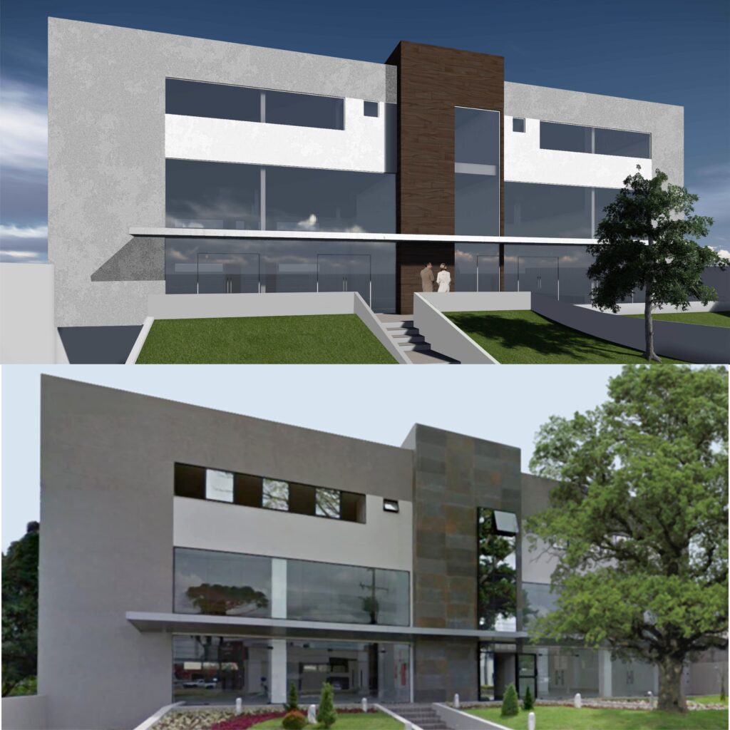
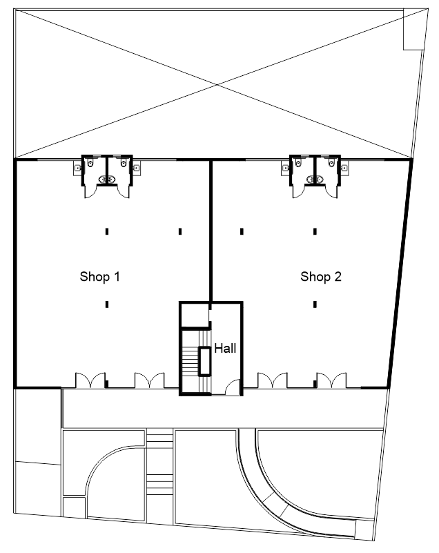
In 2013, one of our clients engaged our practice to develop this commercial project in a very privileged street. While the upper level has 6 offices, the ground floor has 2 spacious shops. However, these shops could be either subdivided into 4 units or grouped into a bigger one.

The project occupies the whole lot frontage, taking advantage of the existing zoning parameters. We allocated one shop on each side of the building, with an entryway to the upper level in the middle. The access to the second floor consists of a stairway and a lift, which form an outstanding volume in the facade.

The local legislation permits mezzanines up to 50% of the shop floor, so we suggested a double-height ceiling. Therefore, the shop tenants would be able to maximize their space. We discussed this idea in advance with the structural engineers, who then considered the mezzanine when doing their calculations.

To visually reduce the double height of the first floor, which has wide shop windows, an aluminium awning runs through the main facade. Large steel corten porcelain tiles from Portobello complement the look, along with textured render in neutral colours.

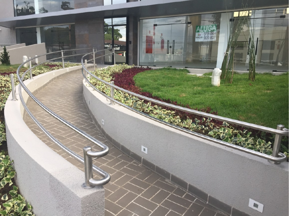
Both the stairway and lift also connect the two floors with the basement, where the parking lot is. Aiming to reduce costs with excavation, we followed the natural profile of the lot. Considering that the ground floor sits 1.6m above the street level, we proposed a curved accessible ramp aiming for accessibility.

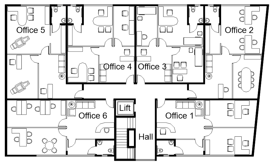
On the second floor, a hall gives access to the six offices. While two of them face the front of the lot, the other four are facing back. Having an open-plan room, each office suite has a small kitchenette and an accessible toilet, as per the local regulations.

The owners wanted to provide infrastructure for the air conditioning system in all offices but, at the same time, give the tenants the option to customize the internal floor plan. Therefore, we simulated a few possible layouts, so the engineers could set the best location for the air conditioning equipment.

Soon after the construction, all units were leased. The location on a privileged street was certainly important for this outcome. However, the well-planned spaces, the good-quality materials, and the elegant facade definitely had a positive impact.

At Instant Design, we have plenty of experience planning commercial spaces. And we are ready to assist you with your next job. For other examples of commercial projects we have done in the past, you may click here and here.

Building renovation: facade uplift

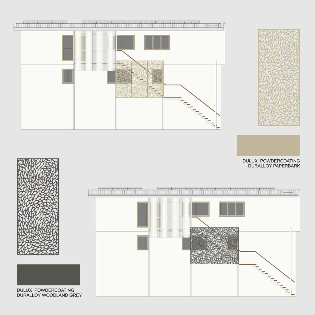
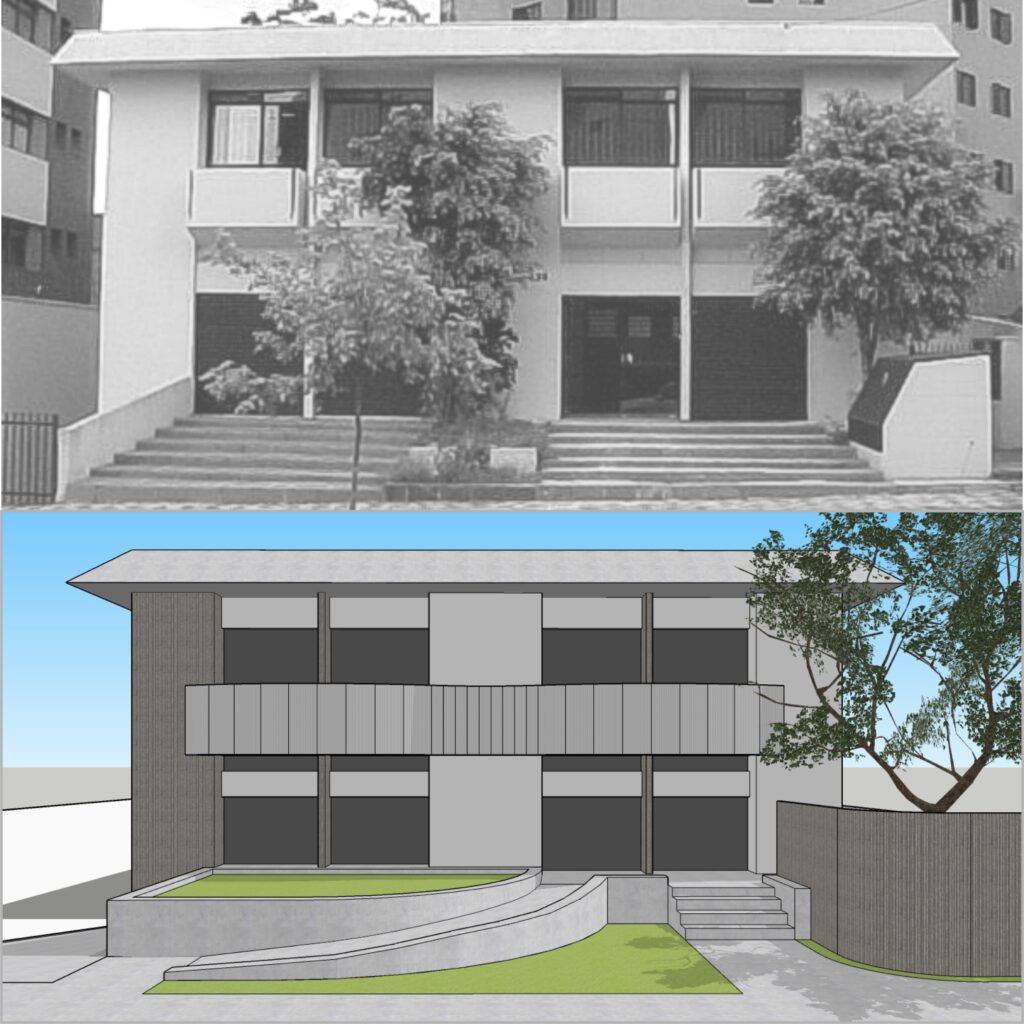
Back in 2012, we had the opportunity to assist one of our corporate clients with this renovation project. The building renovation included not only a facade uplift but also a new internal layout. At the upper level, we proposed curved panels in aluminium to hide the existing individual balconies, bringing movement and unity to the building.

Curves were also present in other elements of this renovation, such as the textured concrete wall which hides a generator, to the right side of the stairway. Or the accessible ramp, which performs a smooth curve that leads to the entry door. Indeed, curved ramps are a clever idea when we need to reach a different level within a small space. We used a similar approach in some of our architectural projects, as you may see here and here.

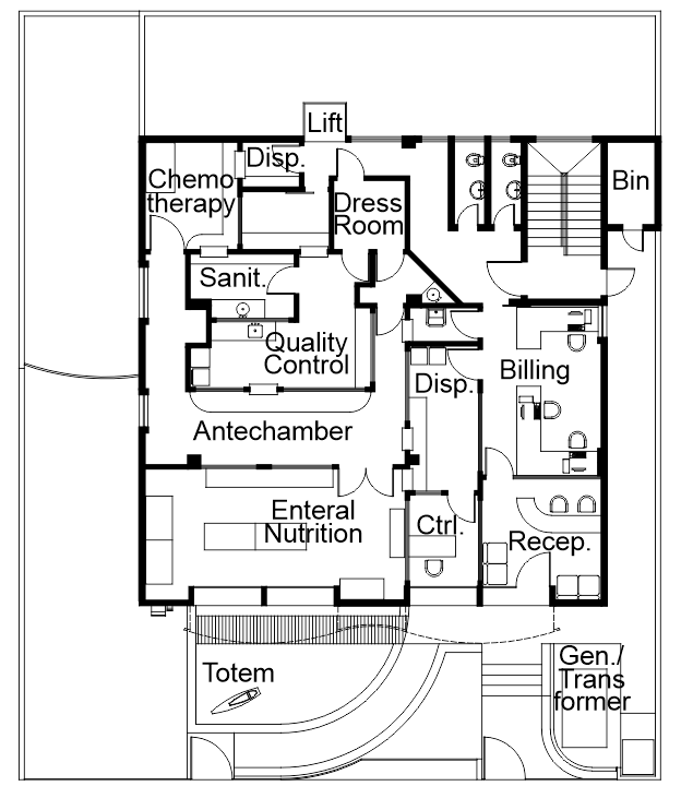
We developed this building renovation project for a company that manipulates enteral nutrition and chemotherapy medication. Our role comprised not only designing a facade uplift and the internal layout for the administrative areas but also coordinating other professionals. Among the external consultants, there was the team in charge of the laboratory equipment and the air conditioning system, for example.

The first floor, located below street level, lodges storage and the logistics department. On the other hand, the second one has the laboratories and the main entry. The original project had two wide stairways leading to the entry, which posed an obstacle for people with disabilities. So we reduced the width of the stairs, proposing an accessible curved ramp instead.

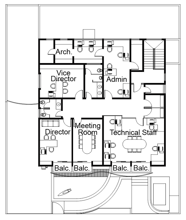
The third floor lodges the administrative staff, a meeting room and the director’s office. On that floor, we took advantage of the existing walls to minimize costs. To complete the project, we designed the landscaping and a totem with the company logo, which was installed in the front garden.

Are you after a building renovation or a facade uplift for your home or office? Maybe colour consulting services? We can assist you!