Tag interiordesign

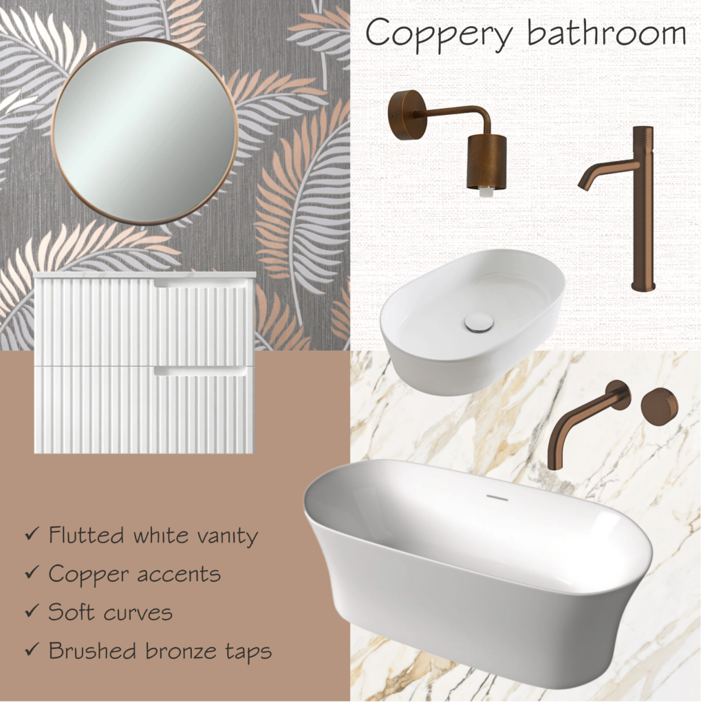
Between copper and bronze

People may get confused about the difference between copper and bronze. While the first is a pure metal, known for its bright orange colour, the latter is an alloy of copper, tending to a brown tone. Either way, both materials go very well with whites and greys. And they will certainly add a touch of sophistication to your bathroom!

In this mood board, we chose brushed bronze for the tapware and the accessories. On the other hand, the wallpaper with a tropical pattern has touches of copper, the same colour as the mirror frame. The bath and basin have soft curves, matching the fluted cabinetry with recessed handles. Aiming to achieve an elegant look, both the sanitaryware and the vanity are white.

On the floor, marble-like tiles with accents in rose gold and grey. On wet walls, where wallpaper is not allowed, we suggest plain tiles in satin white, preferably in a big format.

Are you also hesitant between copper and bronze? What about engaging our services for your bathroom renovation?

Vanity: Satin White Noosa 750mm Wall Hung (Otti)
Basin: Patty Gloss White (ADP)
Bath: Roca Inspira Freetsading 1800mm (Reece)
Tapware: Milli Pure Diamond Texture Handle in Brushed Bronze (Reece)
Wall light: MFL LED Dimmable Wall Bracket in Bronze (Beacon Lighting)
Wallpaper: Cascade Leaf Grey & Rose Gold Fine Decor (World of Wallpaper)
Floor tiles: Calacatta Oro 900mm x 1800mm (Design Tiles)

French bristot and Italian bakery

The idea for this project was to combine a French bristot and Italian bakery when renovating an existing retail store. The owner wanted a place where people could enjoy a good coffee while choosing from a fine selection of pastries. Or, to have a sip of wine while eating a slice of an authentic Neapolitan pizza.

The building comprised a big open area with a kitchen at the back. Our proposal was to transform the existing door between the saloon and the kitchen into an arched window. Therefore, the customers could watch part of the production line, which would entice them to taste the freshly baked treats.

French bistrot and Italian bakery

Right in front of the entry door, we placed the main counter, which showcases the house’s specialties. Among the sweet treats, there are croissants, eclairs, muffins, and cakes. The coffee machine and the appliances to prepare juices and smoothies are on the left side, while the point-of-sale is to the right.

In the sitting area, we suggested some tables scattered around and also booths for a more intimate gathering, combining the atmosphere of a French bristot and Italian bakery. Regarding the finishes and materials, we chose timber panels and the classic bistro furniture, evoking reminiscences from Paris. Aiming to bring a bit from Italy, and add a touch of coziness, we added distressed brick and mustard walls. For the floor, natural stone in a light sand colour.

Are you after plans for a French bristot and Italian bakery? Be it a new cafe or restaurant, we can assist you with the design!

Soaking in a clawfoot bathtub

How cozy is it soaking in a clawfoot bathtub? The feeling of relaxation will be even better if surrounded by elements full of character. As an example, the pedestal basin made of glazed ceramic with a hob-mounted basin mixer in a classic style.

To match, a gooseneck shower arm with rose and other vintage accessories, all in matte black. The same colour was chosen for the clawfoot bathtub and other accessories, such as the pending wall light with a glass globe.

Adding to the nostalgic atmosphere, distressed brick and cement-look tiles. Another good option is whitewashed timber, which may be present in wall panels or pieces of furniture like shelves and cabinets. A rectangular mirror with an antique white frame complements the look, along with plant pots in terracotta.

For more inspiration on bathrooms with an antique or vintage look, please check here and here.

Claw foot bath: Kado Era 1700mm (Reece)
Pedestal basin: Stafford 51 X 43 (Turner Hastings)
Basin mixer & shower mixer: Kado Era (Reece)
Shower & hook: Nostalgia (Phoenix)
Wall light: Ivy 1 Light (Beacon Lighting)
Mirror: Toftbyn white (IKEA)
Floor tile: Windsor Matte Grey Concrete Look 600×600 (Tile Cloud)

Do you also dream of soaking in a clawfoot bathtub after a busy day at work? If you are also in love with this vintage look, let us know! We are more than happy to assist with your new bathroom!

Concept for a design competition

One more snap of this unbuilt project: a concept for a design competition in a conservation area in Fortaleza, Brazil. In this building for a multipurpose cultural centre, we also used eucalyptus poles as the structure system (click here to see the other concept we prepared for this same design competition).

However, this time we adopted a circular plan, which goes around an internal patio. The rounded shape, plus the thatched roof, reminds an “oca”, the vernacular architecture of the local indigenous peoples. At the centre, the uncovered patio helps to cool off the internal temperature, reducing the need for air conditioning. In order to increase the passive cooling effect, we proposed a raked ceiling with higher windows facing the internal patio. Therefore, the hot air may escape upwards.

The facade has a combination of certified wood and masonry rustically rendered, evoking traditional constructive techniques. Both materials – timber and brick – provide good insulation, which is desirable in a tropical climate. On the floor, we suggested the use of demolition timber planks, promoting the use of recycled materials.

When planning this concept for a design competition, we aimed to design a foyer that could double as an art gallery. Also, we proposed two exhibition rooms for audiovisual presentations, which could host events and workshops. At the back, there is a small library and a cafeteria, so the users can read a book while enjoying a coffee. Administrative areas and amenities are also part of the building, which is accessed either by ramps or a stairway.

Would you like to know more about passive cooling and bioarchitecture? Are you after eco-friendly ideas for your new project?

Let’s have a chat!

House extension on a sloped lot

Back in 2001, we were engaged to design a house extension on a sloped lot. With minimal interference on the existing structure, we were able to create three ensuites and plenty of living areas. This was possible by simply knocking out a few walls in order to create doorways and open up the space.

Additionally, we proposed an extension towards the back of the lot. This addition allowed for a new ensuite and a balcony for the master bedroom. The biggest change, though, was building a staircase to connect the main floor with the undercroft. Previously unused, this level now lodges an entertainment room and space for a home office.

At the back of the lot, we proposed a 3-car garage next to the maid’s room. Both are separated from the house by a backyard. To assist with the everyday hop-in and off, a porte cochere sits beside the house, accessed by a side door.

Regarding the facade, we kept the house style, with a high-pitched roof and a gable end over the front door. To reinforce the classic look, we added white mouldings around the windows, contrasting with a darker colour on the walls.

PS. A maid’s room was something common in Brazil until the late 2000s. Not only in upper-class houses but also in middle-class apartments, which is quite curious. Even though a live-in maid was already rare in those days, many families would still have it as a requirement. Nowadays, the idea of having a maid’s room practically disappeared from the project briefing. On the other hand, other spaces have been gaining popularity, such as mudrooms and home offices.

Are you thinking of renovating your house? Get in touch, and we will be more than happy to assist you with plans.

Never considered an orange bathroom? Think twice.

If you never considered an orange bathroom, you should think twice. This colour can definitely bring a boost of energy and joy to your day! However, the secret is using orange as an accent colour, matching it with the right hues. In this mood board, we opted for different tones of grey for a more contemporary atmosphere.

For example, you may have a feature wall with orange mosaic tiles, combined with a concrete-look basin and freestanding bath. Or, you may prefer accessories in bright tangerine, such as the towel rails in acrylic and the mirror from Laufen, which go well with encaustic tiles in different tones of grey. Either way, the outcome will be vibrant and joyful.

For the tapware, you can go with brushed nickel, opting for models with a more futuristic design. Alternatively, you may prefer chrome, such as in this mood board here, which will also provide a good match. Finishing the selection, cement-look tiles on the floor, in a light neutral colour.

Bathtub: Chelsea 1600 (Pietra Bianca)
Basin: Omvivo Villa Above Counter with Shelf 600 in Cove Grey (Reece)
Wall tap: Axia Wall Basin Mixer Set (Phoenix)
Mirror: Laufen Kartell Tangerine Orange (Reece)
Towel rails: Laufen Kartell Tangerine Orange (Reece)
Mosaic tiles: SM 10.46 (Bisazza)
Encaustic tiles: Revival Stachus 200×200 (National Tiles)

Are you thinking of different colours for your bathroom but hesitant about the result? Give us a call and we can assist you! Colour consulting is one of our specialties at Instant Design.

Transforming a 3-bedroom house

Another one of our favourites: transforming a 3-bedroom house into a 4-bedroom one. From a small house with only one bathroom, the owners would now have a master suite. Through a walk-in robe, they gain access to their ensuite, where a curved wall forms the perfect scenario for the walk-in shower.

Attending to their request, an existing patio made room for the new kitchen, with opens to a balcony facing the mountain views. Aiming to assist with storage and keep the kitchen nice and tidy, we proposed a walk-in pantry. It has two doorways, to both sides of the counter, making it easier to get the necessary ingredients when cooking.

Walk-in pantries and butler’s pantries are a must nowadays, some of them with auxiliary sinks and dishwashers. In this case, we didn’t have too much space, so it only lodges the fridge and small appliances. For other projects where we suggested a walk-in pantry, you may click here and here.


Taking advantage of the sloping lot, we proposed a new garage on the undercroft, reducing the existing one to create two new bedrooms. One of them would be a spare room, doubling as a home office. At the same time, we joined two existing bedrooms to form the master suite.

In the front yard, we proposed a firepit area with access both to the kitchen and to the master suite. The wide sliding doors help bring the outdoors inside the house, creating a perfect home for a growing family.

Did you like our concept for this house renovation? Would you like to have your dream project designed by us? Let’s have a chat!

Squares, circles, or a combination of both

This week’s mood board is all about squares, circles, or a combination of both. Aiming for a sleek and contemporary design, we suggest sanitaryware in a squarish shape with soft round corners. For the tapware, wall mixers with square cover plates matching the showerhead from Grohe.

While you may go with other colours, such as black or brushed nickel, we suggest chrome instead. This is because chrome is a timeless and elegant choice that matches all styles.

For the floor, terrazzo tiles with different shades of grey. Even though some people consider terrazzo tiles outdated, we definitely love them! Have a look here for another mood board where we suggested this material.

The cabinetry may be either in white or light grey, in gloss or matt finish. Completing the look, 100×100 gloss white tiles on the wall. Regarding the mirror, we suggest geometric shapes with black metal frame.

Bathtub: Posh Domaine Back to Wall 1700 (Reece)
Basin: Roca Inspira Square Rectangle Above Counter (Reece)
Toilet: Munich Back to Wall (Oliveri)
Wall tap and shower mixer: Grohe Lineare (Reece)
Showerhead: Grohe Rainshower Smartactive Square (Reece)
Terrazzo tiles: Alchemy (Fibonacci)

Are you hesitant between squares, circles, or a combination of both? Get in touch to book an appointment and we can help you to decide!

Get home and relax

At the end of the day, we just want to get home and relax, either soaking in a bath or under a nice waterfall shower. If you have the right colour in your bathroom, the experience is even more enjoyable! Sage green is perfect to create the feeling of relaxation, be it on the fishscale tiles, the freestanding bathtub or the cabinetry.

This colour goes along very well with whites and light greys, creating the perfect environment for relaxation. So you won’t go wrong if you mix this earthy greyish tone of green with a light cement-look floor tile. Or, alternatively, with a white-washed timber tone.

To complement the look, we suggest round basins in matte white, the same material as for the vanity countertop. Regarding accessories, we suggest brushed gold, such as a round mirror and a pendant wall light. For the tapware, wall taps and mixers would follow the same colour scheme.

In saying that, golden accessories offer a perfect match with many other colours, as you may see in other mood boards (here and here).

Vanity: ADP Flo by Alisa & Lysandra Topiary Smooth (Reece)
Bath: Bayley Concrete 1800mm Seafoam (Stonebaths)
Floor Tile: Omniform Grey Textured (Beaumont Tiles)
Wall Tile: Flounder Dip Mint Fishscale (Perini Tiles)
Tapware: Mizu Drift Brushed Brass (Reece)
Wall light: MFL Artisan LED Dimmable (Beacon Lighting)

If you also want to create a wellness retreat at your home, give us a call! We can assist with plans as well as the selection of colours and finishes. Then the only thing you will need is to get home and relax!

Modern mid-century bedroom

We’re in love with the warmness of this modern mid-century bedroom, where pieces of contemporary furniture meet others inspired by the 60s. And all tied together by earthy tones!

In this extension project, the owner would like to have a new master bedroom on the 2nd floor, transforming the existing suite into a guest room. He is a big fan of the mid-century style, having a beautifully decorated living room downstairs. So our goal was to keep consistent with the modernist look when designing the extension.

The proposed concept comprised a generous master bedroom with a walk-in robe and an ensuite. For the bedroom, we proposed a hybrid vinyl floor matching the timber of the existing staircase. Behind the bed, an accent wall in grey contrasts with the other walls in a warm tone of white.

Beside the chest of drawers, a comfortable armchair provides the perfect environment for reading a book, one of the owner’s favourite hobbies. In saying that, book shelves are in every corner, to lodge the owner’s huge library. The modernist vibe continues through the chosen artwork, tapestry, and lighting features, making this modern mid-century bedroom comfy & cozy.

Did you also enjoy the warm colours of this bedroom? Are you after some inspiration for your home renovation? We would love to help you! Get in touch today and book your consultation.