Lovely little house

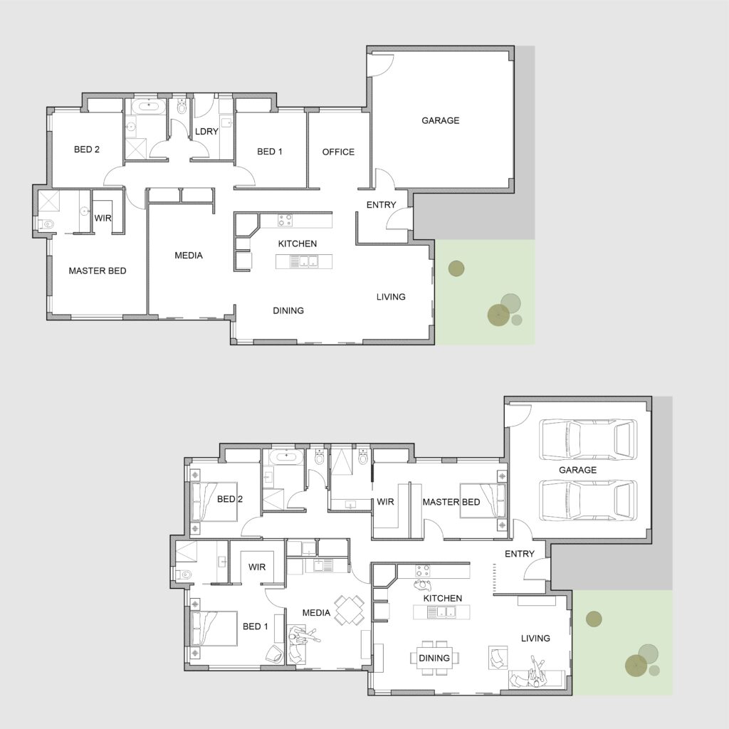
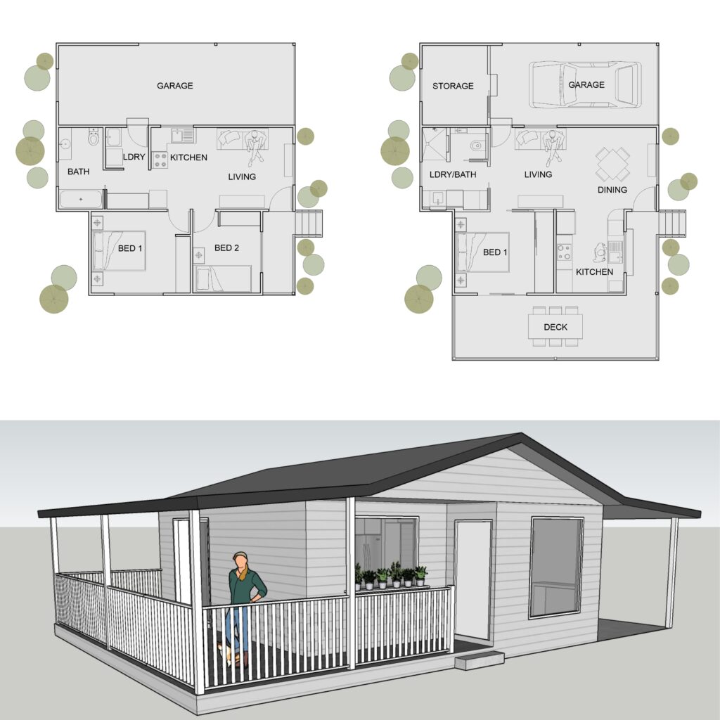
How lovely is this little house with an outdoor patio? We are so thrilled to assist the owner with this renovation project! To suit the owner’s request, we managed to transform a quite small living room into a more spacious living and dining area. In the meantime, the current kitchenette, located in a very dark corner, will become a proper kitchen. It will have plenty of sunlight and more space for appliances and storage, which is great!

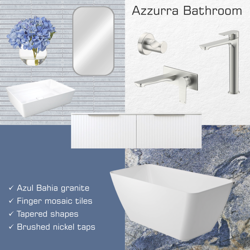
The laundry and the bathroom will now be in the same room. Therefore, we proposed a separate powder room with a wall-hung toilet and a hand basin. Behind the toilet, a feature wall with a niche and LED light will bring some design flair to the enclosure. Moreover, we added a covered patio with access to the bedroom, integrated with the existing porch. The roof above the patio will follow the same pitch as the garage, located on the opposite side of the house. Regarding the garage, we created a storage room at the back, taking advantage of existing walls.


Do you also want to renovate your lovely little house? It doesn’t matter the size of your project. Big or small, give us a call!

Irregular shapes and organic design

This mood board is all about irregular shapes and organic design. From basins and bathtubs to mirrors and wall lights, you won’t find one single straight line here. The exception is the tapware, which has remarkable vertical lines. Regarding the colour for taps and other accessories, we suggest gunmetal, which matches well the earthy tones of the terrazzo floor tile.

The terrazzo itself is marked by irregular shapes and organic design as well. And the combination of greys and light browns is perfect on a white background. On the walls, we suggest accent 3D tiles in sandy tones, with light grey or off-white being another option. For the vanity, we suggest white, the same colour as for the sanitaryware. Plant pots help to create a natural atmosphere, bringing nature to inside this bathroom.

Bathtub: Athenia Freestanding Acrylic Bath (Fienza)
Basin: Contura Freeform Above Counter Basin (Caroma)
Bath mixer: Mecca Freestanding Bath Mixer (Nero Tapware)
Basin mixer: Mecca Tall Basin Mixer (Nero Tapware)
Hook: Koti Wall Hook (RJ Living)
Floor tile: Livorno Ghia Porcelain Terrazzo (Perini Tiles)
Wall tile: Hellin Bianco Line Porcelain (Perini Tiles)
Wall light: Ludivica & Roberto Palomba (Temple & Webster)
Mirror: Silver Eilish Metal Mirror (Temple & Webster)

Privacy for a growing family

The main goal of this renovation project was to create more privacy for the members of a growing family. Initially, they wanted to isolate the existing master bedroom from the rest of the house, adding to it a separate living area. This bedroom would then be occupied by the owner’s daughter and her partner.

So the first step was to make room for a second master bedroom, for the parents. Since the family didn’t use the office very often, we opened it to an adjoining bedroom, creating a master suite with a walk-in robe. We then transformed the laundry into an ensuite, taking advantage of the existing plumbing.


The owners wanted a European-style laundry, so we adapted one of the cupboards along the corridor to place the trough. We also made room for a stackable washing machine and dryer, as well as a bigger cupboard beside it. Since we had to bring pipes to the new laundry, we installed a small kitchenette on the other side of the wall. The kitchenette faces the media room, having a frigobar, a microwave, and a sink.

The media room now works as a living area for the owner’s daughter and her partner. It has a private access to the outdoors, allowing for the young couple’s own routine. However, the room is still connected to the rest of the house through an internal door.

Last, but not least, the owners complained about the corridor that leads to the bedrooms being too dark. Aiming to bring more light to this part of the house, we removed an existing wall at the entry hall. We proposed a feature screen instead, made of timber battens from floor to ceiling.

Do you also want more privacy for your growing family? Or maybe adapt your house to new circumstances? Get in touch for a quote!

Colour of the year 2024

Generally by springtime, paint manufacturers forecast the next year’s colour trends. For many of them, the colour of the year 2024 will be blue (Sherwin-Williams, Dunn-Edwards, Valspar, Minwax, etc). However, from all the hues of blue presented, Blue Nova was our preferred one. This is a beautiful blue-violet from Benjamin Moore, which illustrates today’s mood board.

This intense colour reminds me of the beautiful tones of blue from Azul Bahia, a rare granite from my homeland, Brazil. When using this beautiful stone on the floor or the benchtop, you may want to go with Kit Kat tiles in bluish-grey for the walls. Or, alternatively, a satin white tile instead, which goes well with blues.

For the basin and the freestanding bathtub, we suggest gloss-white pieces with a tapered shape. The vanity may be a wall-hung unity with drawers. The handles are in brushed nickel, the same colour chosen for the tapware and accessories. To complement the look, a pill-shaped mirror with a satin finish frame. If you want to see another one of our mood boards with blue tones, please click here.

Vanity: Ashley 1200mm Wall Hung (ADP)
Basin: RAK Feeling Rectangular Above Counter (Fienza)
Bathtub: Utopia Gloss Solid Cast Marble (ADP)
Tapware: Milli Trace Brushed Nickel (Reece)
Hook: Mecca Robe Hook (Nero Tapware)
Paint: Blue Nova 825/CC-860 (Benajmin Moore)
Granite: Azul Bahia (Signorino)
Finger mosaic tiles: Ignite Sky Gloss (Beaumont Tiles)
Plant: Potted Faux Hydrangea Plant (Temple and Webster)

Are you interested in colour consulting services for your new house or renovation? Book a design consultation today!

Hand-crafted wooden bathtub

How nice is this hand-crafted wooden bathtub! Having a unique design, this bath perfectly matches the vanity in real timber, creating a natural atmosphere for your bathroom. Besides the cabinetry itself, this vanity has also a countertop in timber, which adds to its charm.

Regarding the exposure to water, this wooden bathtub is hand-crafted with the same techniques used by boat builders. A similar approach applies to the vanity, which has a few coats of polyurethane in order to protect the timber from water spills.

Other decorative elements in timber help to set the mood, such as the asymmetric mirror and the wall light. Hooks, stools, and cachepots in timber are also good options to create a woody bathroom. For the tapware, we suggest a bronze living finish, which will get tannish over the years. The cross-shape handles help create a rustic look. As a background, cement-look tiles on the floor and penny-round tiles on the walls, both in a light grey tone.

For other mood boards where we used timber, have a look here and here.

Bathtub: Tasmanian Oak Barrel (Wood and Water)
Vanity: Kado Arc Twin Drawer Timber Top Australian Chestnut (Reece)
Tapware: Portsea Basin Set Autumn Bronze (Par Taps)
Mirror: Mid-Century Asymmetrical Wood Wall Mirror (West Elm)
Wall light: Button Sconce (Fluxwood Lighting)
Cachepot: Dansk Tub Pot (The Banyan Tree)
Hook: Button Wall Hook (Freedom)
Floor tile: Byron Travertine Look Grey Matte (Tile Cloud)
Wall tile: Perla Penny Round (Perini Tiles)

Did you enjoy this woody bathroom? We can assist with your renovation or decoration! Get in touch today for more details!

Between copper and bronze

People may get confused about the difference between copper and bronze. While the first is a pure metal, known for its bright orange colour, the latter is an alloy of copper, tending to a brown tone. Either way, both materials go very well with whites and greys. And they will certainly add a touch of sophistication to your bathroom!

In this mood board, we chose brushed bronze for the tapware and the accessories. On the other hand, the wallpaper with a tropical pattern has touches of copper, the same colour as the mirror frame. The bath and basin have soft curves, matching the fluted cabinetry with recessed handles. Aiming to achieve an elegant look, both the sanitaryware and the vanity are white.

On the floor, marble-like tiles with accents in rose gold and grey. On wet walls, where wallpaper is not allowed, we suggest plain tiles in satin white, preferably in a big format.

Are you also hesitant between copper and bronze? What about engaging our services for your bathroom renovation?

Vanity: Satin White Noosa 750mm Wall Hung (Otti)
Basin: Patty Gloss White (ADP)
Bath: Roca Inspira Freetsading 1800mm (Reece)
Tapware: Milli Pure Diamond Texture Handle in Brushed Bronze (Reece)
Wall light: MFL LED Dimmable Wall Bracket in Bronze (Beacon Lighting)
Wallpaper: Cascade Leaf Grey & Rose Gold Fine Decor (World of Wallpaper)
Floor tiles: Calacatta Oro 900mm x 1800mm (Design Tiles)

French bristot and Italian bakery

The idea for this project was to combine a French bristot and Italian bakery when renovating an existing retail store. The owner wanted a place where people could enjoy a good coffee while choosing from a fine selection of pastries. Or, to have a sip of wine while eating a slice of an authentic Neapolitan pizza.

The building comprised a big open area with a kitchen at the back. Our proposal was to transform the existing door between the saloon and the kitchen into an arched window. Therefore, the customers could watch part of the production line, which would entice them to taste the freshly baked treats.

French bistrot and Italian bakery

Right in front of the entry door, we placed the main counter, which showcases the house’s specialties. Among the sweet treats, there are croissants, eclairs, muffins, and cakes. The coffee machine and the appliances to prepare juices and smoothies are on the left side, while the point-of-sale is to the right.

In the sitting area, we suggested some tables scattered around and also booths for a more intimate gathering, combining the atmosphere of a French bristot and Italian bakery. Regarding the finishes and materials, we chose timber panels and the classic bistro furniture, evoking reminiscences from Paris. Aiming to bring a bit from Italy, and add a touch of coziness, we added distressed brick and mustard walls. For the floor, natural stone in a light sand colour.

Are you after plans for a French bristot and Italian bakery? Be it a new cafe or restaurant, we can assist you with the design!

Extension project for a university campus

In this extension project for a university campus, the task was to design a 6-storey building to lodge a few different courses. Among them, there were vocational educational and training courses as diverse as lutherie, gas & petroleum, and IT. Or real estate business, institutional communication, and quality management. Each one with its own specificities and requirements in terms of space.

The building was part of a complex of existing buildings and its footage would replace a covered patio and part of the parking lot. Regarding the project briefing, there were chemistry and audiovisual laboratories, including a semi-anechoic chamber. In this chamber, future luthiers would be able to test the musical instruments they design and produce during the course.

The extension project also included a new library for the university campus, as well as an auditorium and meeting rooms. Finally, the building comprised computer laboratories and conventional classrooms of various sizes, besides amenities and storage rooms.


The floors are interconnected by lifts, staircases, and a ramp. The ramp runs within a void, which spans through all 6 levels, visually integrating the internal space. For the facade, contemporary lines and geometric shapes. The chosen finish was ceramic tiles in white and blue, as per the surrounding buildings and the institutional standards.

Wide glass panels strategically positioned help bring light to the interior. The widest panel, located at a northwest facade, has a photovoltaic film that generates electricity. We also suggest other sustainable features, such as green roofs over the hallways that connect this building to the adjacent ones.

For other projects where we had the opportunity to propose sustainable solutions, please click here and here.

Are you also after sustainable solutions for your home or office? Please get in touch!

Every millimetre matters

When designing a small powder room or ensuite, every millimetre matters. Check our tips to deal with compact bathrooms and other tiny spaces!

For example, you may use cavity sliding doors instead of hinged ones, being able to have a wide doorway to access the room. Regarding sanitaryware, toilets with in-wall flush systems are great space-savers, for example, as the cistern is concealed inside the wall frame.

You may use the standard flush buttons or ones with touchless technology, as you may see here. Besides compact toilets, there are many models of slim wall-hung vanities in the market, providing clever storage solutions. In saying that, while some may prefer a standard mirror, others may opt for a shaving mirror cabinet. Some shaving cabinets can be semi-recessed in the wall, providing extra storage space.

Aiming to bring some coziness, we suggest using light tones of grey and accents in timber. In this mood board, we have a mirror with a frame in light oak, the same colour chosen for the towel hook and the pendant light. For the tapware, brushed nickel with a contemporary design and straight lines, matching the wallpaper and the floor tiles.

Vanity: Petite 400 Wall Hung (ADP)
Toilet: Roca Inspira (Reece)
Flush button: Geberit Sigma 01 (Reece)
Tapware and accessory: Tono (Fienza)
Hook: Classic Kink Wall Hook (Scandiluxe)
Mirror: Tina Round (Temple & Webster)
Pending light: Juno 1 (Beacon Lighting)
Floor tile: Caparazon Medio (Perini Tiles)
Wallpaper: Maui Leaf Monochrome (World of Wallpaper)

Are you struggling with a small powder room or any other room where every millimetre matters? We are glad to help you optimise your space!

Concept for a design competition

One more snap of this unbuilt project: a concept for a design competition in a conservation area in Fortaleza, Brazil. In this building for a multipurpose cultural centre, we also used eucalyptus poles as the structure system (click here to see the other concept we prepared for this same design competition).

However, this time we adopted a circular plan, which goes around an internal patio. The rounded shape, plus the thatched roof, reminds an “oca”, the vernacular architecture of the local indigenous peoples. At the centre, the uncovered patio helps to cool off the internal temperature, reducing the need for air conditioning. In order to increase the passive cooling effect, we proposed a raked ceiling with higher windows facing the internal patio. Therefore, the hot air may escape upwards.

The facade has a combination of certified wood and masonry rustically rendered, evoking traditional constructive techniques. Both materials – timber and brick – provide good insulation, which is desirable in a tropical climate. On the floor, we suggested the use of demolition timber planks, promoting the use of recycled materials.

When planning this concept for a design competition, we aimed to design a foyer that could double as an art gallery. Also, we proposed two exhibition rooms for audiovisual presentations, which could host events and workshops. At the back, there is a small library and a cafeteria, so the users can read a book while enjoying a coffee. Administrative areas and amenities are also part of the building, which is accessed either by ramps or a stairway.

Would you like to know more about passive cooling and bioarchitecture? Are you after eco-friendly ideas for your new project?

Let’s have a chat!