Commercial project in a privileged street
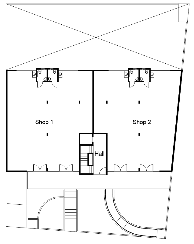
In 2013, one of our clients engaged our practice to develop this commercial project in a very privileged street. While the upper level has 6 offices, the ground floor has 2 spacious shops. However, these shops could be either subdivided into 4 units or grouped into a bigger one.
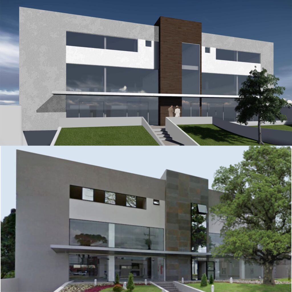
The project occupies the whole lot frontage, taking advantage of the existing zoning parameters. We allocated one shop on each side of the building, with an entryway to the upper level in the middle. The access to the second floor consists of a stairway and a lift, which form an outstanding volume in the facade.
The local legislation permits mezzanines up to 50% of the shop floor, so we suggested a double-height ceiling. Therefore, the shop tenants would be able to maximize their space. We discussed this idea in advance with the structural engineers, who then considered the mezzanine when doing their calculations.
To visually reduce the double height of the first floor, which has wide shop windows, an aluminium awning runs through the main facade. Large steel corten porcelain tiles from Portobello complement the look, along with textured render in neutral colours.
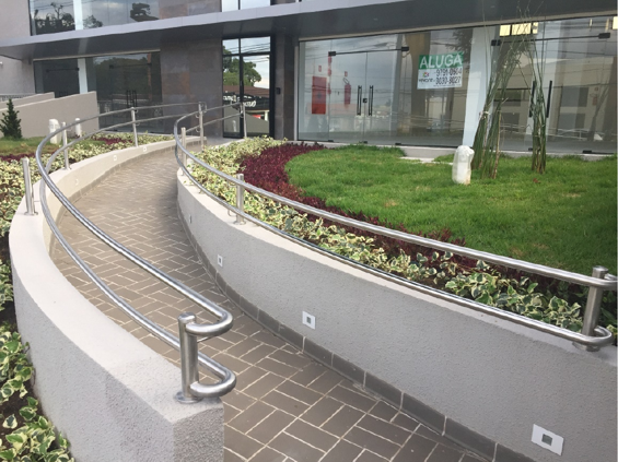
Both the stairway and lift also connect the two floors with the basement, where the parking lot is. Aiming to reduce costs with excavation, we followed the natural profile of the lot. Considering that the ground floor sits 1.6m above the street level, we proposed a curved accessible ramp aiming for accessibility.
On the second floor, a hall gives access to the six offices. While two of them face the front of the lot, the other four are facing back. Having an open-plan room, each office suite has a small kitchenette and an accessible toilet, as per the local regulations.
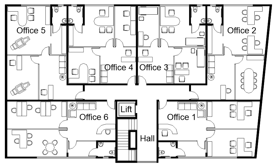
The owners wanted to provide infrastructure for the air conditioning system in all offices but, at the same time, give the tenants the option to customize the internal floor plan. Therefore, we simulated a few possible layouts, so the engineers could set the best location for the air conditioning equipment.
Soon after the construction, all units were leased. The location on a privileged street was certainly important for this outcome. However, the well-planned spaces, the good-quality materials, and the elegant facade definitely had a positive impact.
At Instant Design, we have plenty of experience planning commercial spaces. And we are ready to assist you with your next job. For other examples of commercial projects we have done in the past, you may click here and here.
