Archives August 2023

Transforming a 3-bedroom house

Another one of our favourites: transforming a 3-bedroom house into a 4-bedroom one. From a small house with only one bathroom, the owners would now have a master suite. Through a walk-in robe, they gain access to their ensuite, where a curved wall forms the perfect scenario for the walk-in shower.

Attending to their request, an existing patio made room for the new kitchen, with opens to a balcony facing the mountain views. Aiming to assist with storage and keep the kitchen nice and tidy, we proposed a walk-in pantry. It has two doorways, to both sides of the counter, making it easier to get the necessary ingredients when cooking.

Walk-in pantries and butler’s pantries are a must nowadays, some of them with auxiliary sinks and dishwashers. In this case, we didn’t have too much space, so it only lodges the fridge and small appliances. For other projects where we suggested a walk-in pantry, you may click here and here.
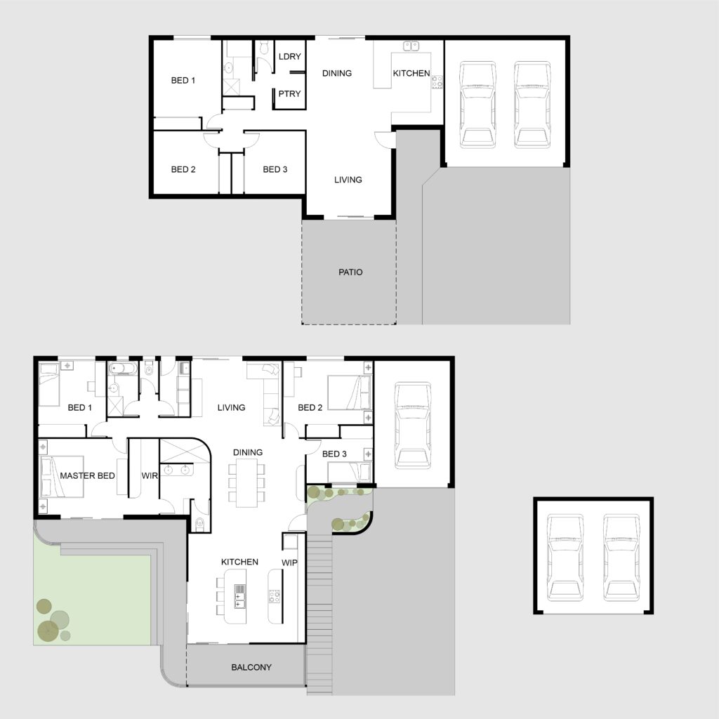

Taking advantage of the sloping lot, we proposed a new garage on the undercroft, reducing the existing one to create two new bedrooms. One of them would be a spare room, doubling as a home office. At the same time, we joined two existing bedrooms to form the master suite.

In the front yard, we proposed a firepit area with access both to the kitchen and to the master suite. The wide sliding doors help bring the outdoors inside the house, creating a perfect home for a growing family.

Did you like our concept for this house renovation? Would you like to have your dream project designed by us? Let’s have a chat!
Squares and circles, or a combination of both

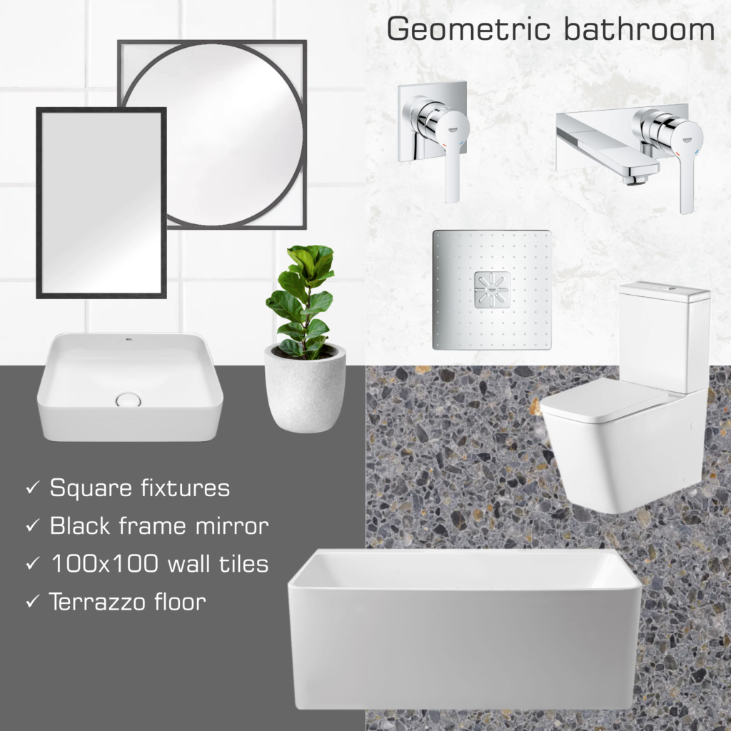
This week’s mood board is all about squares and circles, or a combination of both. Aiming for a sleek design, we suggest basins, toilets, and baths in a squarish shape with soft round corners. For the tapware, wall mixers with square cover plates matching the showerhead from Grohe. While you may go with other colours, such as black or brushed nickel, we suggest chrome, which is timeless and elegant.

For the floor, terrazzo tiles with different shades of grey. Even though some people consider terrazzo tiles outdated, we definitely love them! Have a look here for another mood board where we suggested this material. Cabinetry may be either in white or light grey, in gloss or matt finish. Completing the look, 100×100 gloss white tiles on the wall and a mirror with a geometric shape and black metal frame.

Bathtub: Posh Domaine Back to Wall 1700 (Reece)
Basin: Roca Inspira Square Rectangle Above Counter (Reece)
Toilet: Munich Back to Wall (Oliveri)
Wall tap and shower mixer: Grohe Lineare (Reece)
Showerhead: Grohe Rainshower Smartactive Square (Reece)
Terrazzo tiles: Alchemy (Fibonacci)

Are you hesitant between square and round? Or maybe you want a bit of both? Get in touch to book an appointment and we can help you to decide!

No job is too small

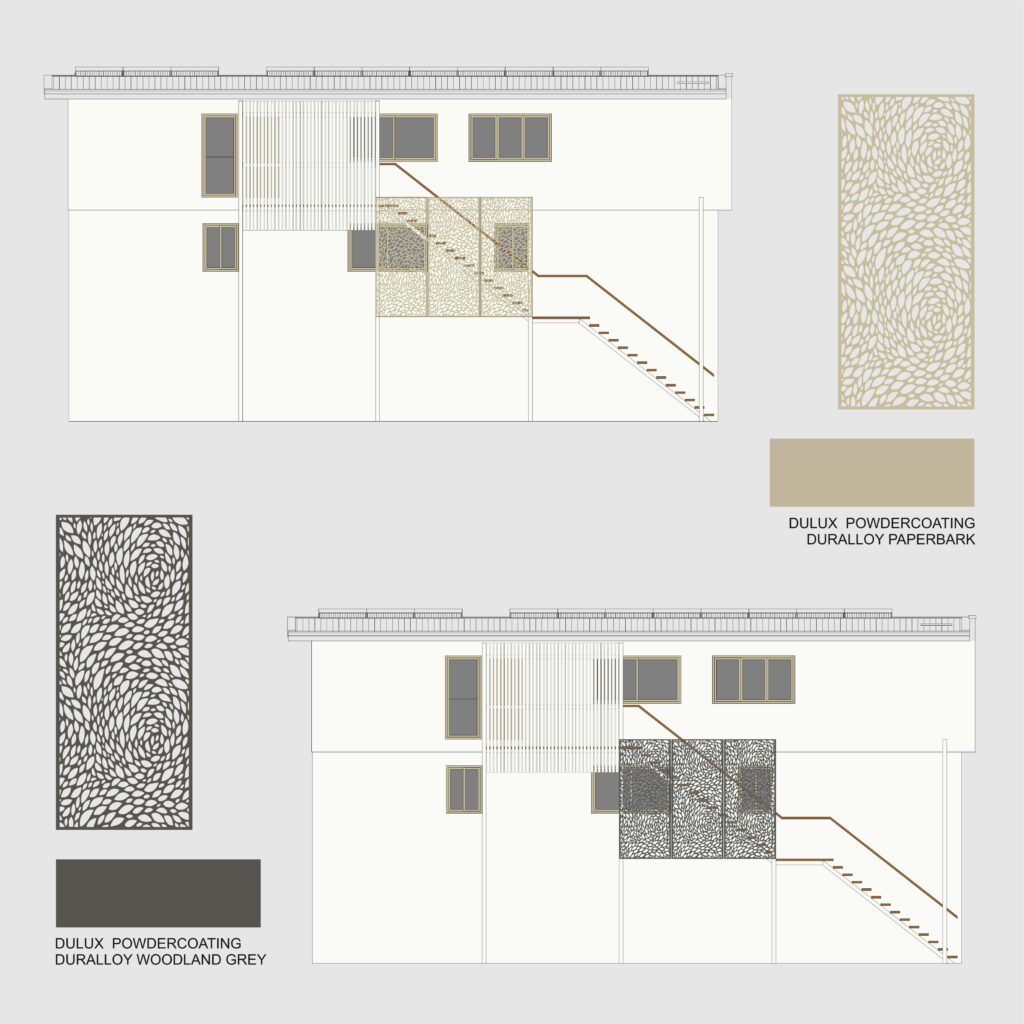
No job is too small when we love what we do! Be it designing a whole new house or a custom-made screen like in this project. In this example, the clients had recently added a third floor to their house, an extension designed by others. In order to provide independent access to the new floor – which has a self-contained unit – a stairway was built to the side of the house.

Aiming to improve the look of the side facade, the clients wanted to install privacy screens. Therefore, they hired us to explore a few ideas. The goal was to visually reduce the impact of the long stairway, taking advantage of the existing columns to support the screens. Their initial idea was to have two types of screens: vertical slats and a perforated decorative pattern. So the first step was to explore a few different combinations regarding size and shapes.

After they decided on the screen pattern (Reptilia, from Decorative Screens Direct), we did a few colour simulations. Since the screens are in aluminium, we worked based on the available Dulux Powdercoating colour chart. Among the options we suggested, were either Paperback – matching the window frames – or Woodland Grey – contrasting with the white walls.

Which one do you prefer? And which one do you think they went for?


Are you also thinking of installing privacy screens in your house? Are you finding it difficult to choose either the right model or colour? Let’s have a chat!

Get home and relax

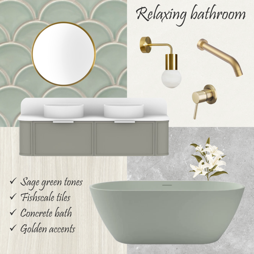
At the end of the day, we just want to get home and relax, either soaking in a bath or under a nice waterfall shower. If you have the right colour in your bathroom, the experience is even more enjoyable! Sage green is perfect to create the feeling of relaxation, be it on the fishscale tiles, the freestanding bathtub or the cabinetry.

This colour goes along very well with whites and light greys, creating the perfect environment for relaxation. So you won’t go wrong if you mix this earthy greyish tone of green with a light cement-look floor tile. Or, alternatively, with a white-washed timber tone.

To complement the look, we suggest round basins in matte white, the same material as for the vanity countertop. Regarding accessories, we suggest brushed gold, such as a round mirror and a pendant wall light. For the tapware, wall taps and mixers would follow the same colour scheme.

In saying that, golden accessories offer a perfect match with many other colours, as you may see in other mood boards (here and here).

Vanity: ADP Flo by Alisa & Lysandra Topiary Smooth (Reece)
Bath: Bayley Concrete 1800mm Seafoam (Stonebaths)
Floor Tile: Omniform Grey Textured (Beaumont Tiles)
Wall Tile: Flounder Dip Mint Fishscale (Perini Tiles)
Tapware: Mizu Drift Brushed Brass (Reece)
Wall light: MFL Artisan LED Dimmable (Beacon Lighting)

If you also want to create a wellness retreat at your home, give us a call! We can assist with plans as well as the selection of colours and finishes. Then the only thing you will need is to get home and relax!

Modern mid-century bedroom

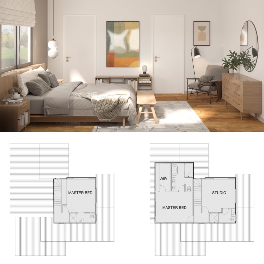
We’re in love with the warmness of this modern mid-century bedroom, where pieces of contemporary furniture meet others inspired by the 60s. And all tied together by earthy tones! In this renovation project, the owner asked for a new master bedroom on the 2nd floor. Then, he wanted to transform the existing one into a studio and guest room. Above all, though, he was a big fan of the modern mid-century look and would like this style for his master bedroom.

The proposed extension comprised a generous master bedroom with a walk-in robe and an ensuite. For the bedroom, we proposed a hybrid vinyl floor matching the timber of the existing staircase. Behind the bed, an accent wall in grey contrasts with the other walls in white.

Beside the chest of drawers, a comfortable armchair provides the perfect environment for reading a book, one of the owner’s favourite hobbies. Book shelves are in every corner, to lodge the owner’s huge collection. The modernist vibe continues through the artwork, the tapestry, and the lighting features, making this bedroom comfy & cozy.

Did you also enjoy the warm colours of this bedroom? Are you after some inspiration for your home renovation? We would love to help you! Get in touch today and book your consultation.

Assisted bathrooms: more and more popular

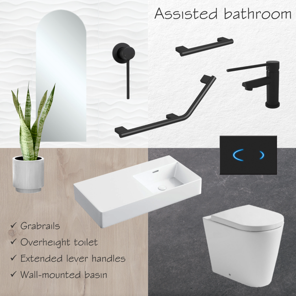
Assisted living bathrooms are becoming more and more popular. Especially with an increase in the elderly population, allowing people to stay longer in their own homes. These bathrooms provide a few different features, both for safety and accessibility, such as grabrails and overheight toilets.

These overheight toilets can be installed with sensor flush buttons, for example, which are touchless and therefore more hygienic. Electronic bidets are also useful when talking about hygiene. Some brands of bidets can be coupled with existing toilets, depending on the size and shape of the pan. They offer an additional level of comfort for the user, with heated seats and different jets of water.

For wheelchair users, mixers with extended levers are essential, as well as wall-mounted basins and walk-in showers. For low-vision users, matte black tapware offers good contrast with white tiles, making it easy to locate the handles. On the floor, a slip-resistant tile is a great option to prevent accidents. This feature is useful not only for the elderly but for anyone who wants a safer bathroom.

Overheight toilet: Kado Lux (Reece)
Flush button: Hideaway Sensor (Reece)
Wall-mounted basin: Petra 800 (Fienza)
Tapware: Hustle Care (Fienza)
Grabrails: Mizu Assisted Living (Reece)
Mirror: Arch Mirror 450×1175 (Fienza)
Floor tiles: Concrete Fusion Anthracite (National Tiles)
Wall tiles: 3D Wave Gloss (National Tiles)

Are you thinking of adapting your bathroom as well? It’s not all about a nice look: you also need to take into account the standards and regulations.

Instant Design has the skills to assist you in this matter. Get in touch today to book a consultation!

Corporate project for a multinational company

A few years ago we were engaged to work on a corporate project for a multinational company: their new educational facilities in Curitiba, Brazil. This company is from Germany, but its South American headquarters are located in Curitiba. The production site spreads around 20,000 sqm of built area, where they manufacture machines for the textile industry. Besides Germany and Brazil, they have units in China, India, Mexico, and the USA, among other countries.

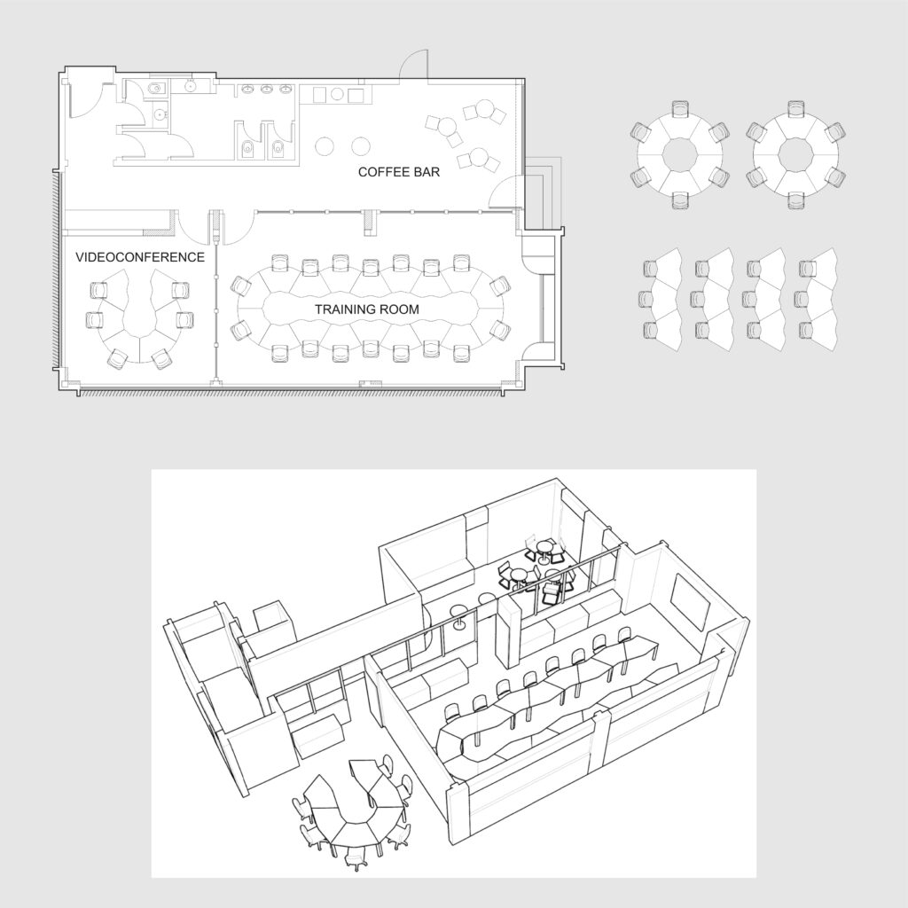
The corporate project for this multinational company involved the renovation of an existing ground-floor building. The educational facilities would have a training room and a videoconference room, as well as toilets and a cafeteria. As per the clients’ request. we used state-of-the-art features. As an example, we specified double glass partitions with blinds operated by remote control for the training room.

Aiming to allow multiple uses of the space, we chose a flexible range of office desks. This furniture allowed for different configurations, such as meeting rooms, classrooms, or team groups. For the coffee bar, we proposed a small kitchenette and tall tables with stools, aiming to create engagement among the attendees. Regarding finishes and materials, we opted for light oak partitions, suggesting neutral greys for both the carpet and floor tiles. For the office chairs, we chose tan leather, the same finish as the stools in the cafeteria.

This was not the only corporate project designed by us. At Instant Design we have plenty of experience in designing commercial spaces, as you may see here or here.

Are you thinking about uplifting your office? Or maybe setting up a new business and in need of some ideas? Let’s have a chat!

Corten steel for a minimalist bathroom

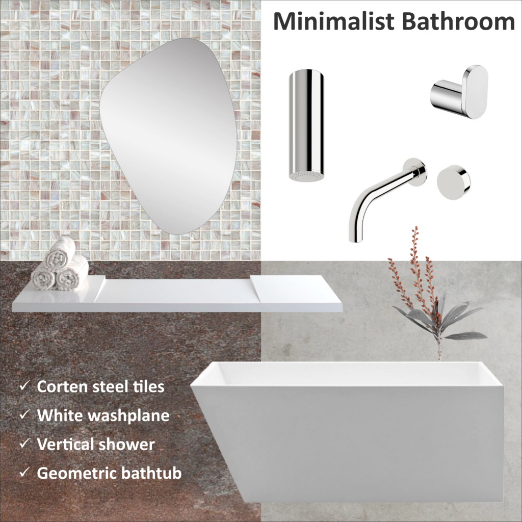
The warm tones of corten steel in this minimalist bathroom are a perfect scenario for the wash plane and bathtub with straight lines. And we are so glad that we could find in Australia the same steel corten tiles from Portobello that we used in one of our past projects. You may check more info on this project here, where the corten steel look-like tile was used as a feature on the external facade.

Going back to our minimalist bathroom, the rust-like appearance of the steel after being exposed to the elements is one of our favourite patterns. Especially when combined with light grey cement and mosaic tiles in off-white, it’s a very nice combination. And talking about mosaic tiles, we love them as much as corten steel! You may see other mood boards where we used mosaic tiles here and here.

The minimalist look is complete with a vertical ceiling shower and a wall basin spout with a progressive mixer, all in chrome. In addition, you may have a frameless mirror with an irregular shape or a simple round one. One or two robe hooks as accessories and that is it. After all, less is more!

Washplane: Geo (Omvivo)
Bath tub: Latis 1600 (Omvivo)
Corten steel tile: Steel corten 60×120 (Portobello, available in Australia at Tile Mega Mart)
Vertical shower: Circa (Sussex Tapware)
Wall basin mixer: Mili Pure Progressive (Reece)
Robe hook: Empire (Temple & Webster)
Mirror: Erwyn Organic Wall Mirror (Temple & Webster)

Did you like this look? At Instant Design we can assist you in selecting the right finishes and materials for your new house or renovation.

Sustainable building for a community centre

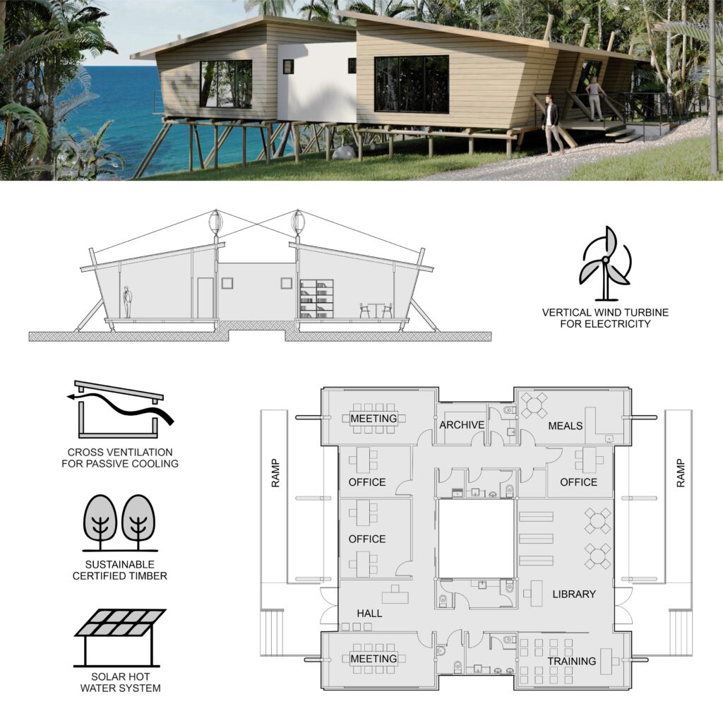
In this sustainable building for a community centre, our goal was to explore renewable solutions and use local materials. As part of an architectural competition that comprised two other buildings, we opted for eucalyptus poles as the structural system, with all other buildings sharing the same approach. For the external cladding, we chose certified timber, ensuring the material is from sustainable forests. Regarding the floor, we suggested demolition timber planks.

Aiming for passive cooling, we proposed raked ceilings with cross ventilation and an internal yard. The yard not only assists in cooling off the temperature but also brings natural light to the internal corridors. The same solution was used in another building that was part of the same complex, as you may see here. Regarding accessibility, we proposed two ramps on each side of the building, making it easier for people with disabilities to access the community centre.

Taking advantage of the site’s location, in a coastal area in the Northeast of Brazil, we allocated low-noise compact wind turbines on the roof. They would assist with electricity generation and also create an interesting feature, with its axis anchored in the eucalyptus poles. Furthermore, we proposed solar panels for the hot water system, as the region where the building sits has plenty of sun all year round.

Design competitions are a great way for architects to drive innovation and boost creativity. Are you after innovative and creative solutions for your house? Do you want to know more about passive cooling and sustainable design?

Let’s have a chat! Send us an email or give us a call and we will be happy to assist you!